Color Psychology: How Colors Influence Emotions and Buying Decisions (The Real Research)
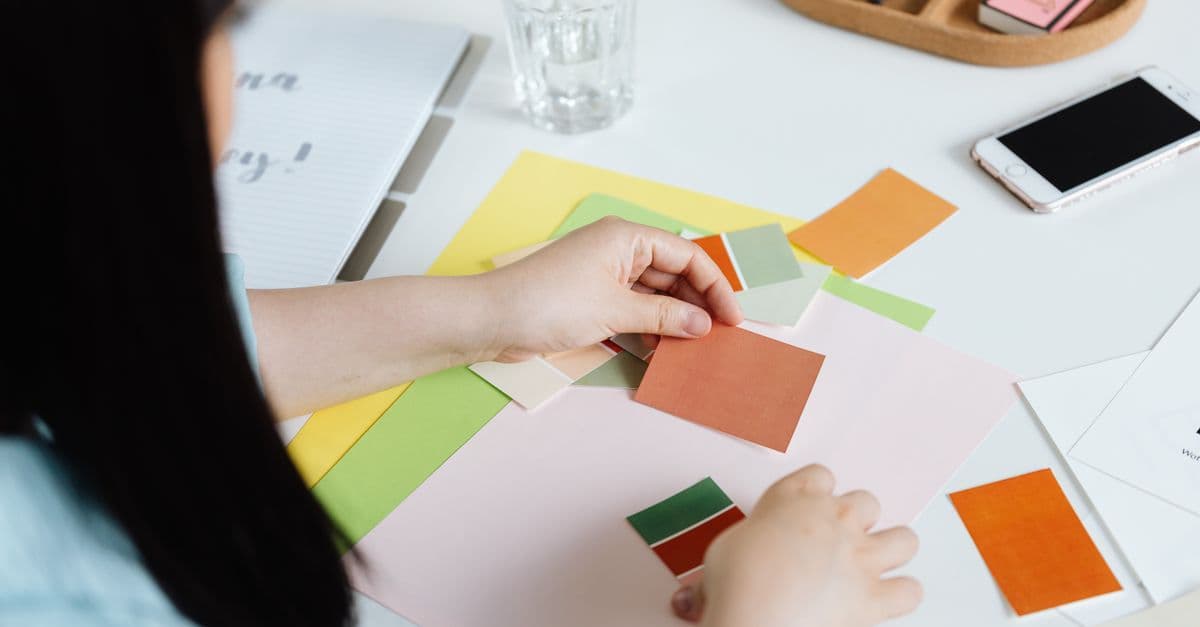
Photo: www.kaboompics.com / Pexels
Walk into a car dealership and the walls are painted blue and gray. Visit a fast-food restaurant and the dominant colors are red and yellow. Scroll through social media and luxury brands use black, white, and gold. These choices are not accidents; they are deliberate applications of color psychology, the field studying how colors affect mood, perception, and behavior. The assumptions underlying these choices — red triggers hunger, blue conveys trust, yellow energizes — are so deeply embedded in marketing practice that questioning them feels heretical. Yet the scientific evidence is more tentative than the marketing industry believes. This article examines what peer-reviewed research actually shows about color and emotion, explores cultural variation in color response, and addresses the replication crises that revealed many earlier color-psychology studies were unreliable.
What Color Psychology Research Actually Shows
The foundational question: Do colors trigger emotional responses directly, or does our response depend on learned cultural associations?
In controlled laboratory settings, colors do produce measurable physiological responses. Red exposure increases heart rate and skin conductance (a marker of arousal). Blue exposure decreases cortisol (a stress hormone) and increases perceived calmness. Yellow and orange increase visual attention and perceived energy. These findings are robust across multiple studies and have been replicated.
However, the effect sizes are modest: 5–15 percent variance in most measures. A study showing that red increases heart rate compared to blue might show a heart rate increase of 65 bpm (red) versus 60 bpm (blue), a physiologically real but small difference. Marketing claims often extrapolate from these small effects to predict large behavioral changes ("red increases purchasing by 40 percent"), which is not supported.
Effect size measures the magnitude of a treatment's impact. A small effect size (0.2 standard deviations) means the treatment explains 4 percent of variance; a medium effect size (0.5 SD) means 15–20 percent; a large effect size (0.8 SD) means 30–40 percent. Most color psychology effects are in the small-to-medium range.
The mechanistic interpretation — that colors trigger emotions directly — is partially correct but incomplete. Colors do activate neural systems associated with arousal and attention. Red light, with its longer wavelength, is processed earlier in the visual cortex and activates threat-detection systems. Blue light, perceived as cooler, activates systems associated with distance and safety. These are not learned associations; they are hard-wired visual processing.
However, the emotional response you report ("This red makes me feel excited") depends on what the red signifies in your cultural context. In Western cultures, red signals danger, urgency, and alertness because of repeated exposure (warning signs, emergency lights, stop lights). In Chinese cultures, red signals prosperity, luck, and celebration. These learned associations can override the direct physiological response. If a culture were to pair red with relaxation from childhood (hypothetically), adults might report red as calming despite the underlying physiological arousal.
Source: Labrecque, L.I. and Milne, G.R. (2012), "Exciting Red and Competent Blue: The Importance of Color in Marketing," Journal of the Academy of Marketing Science, Vol. 40 — meta-analysis of color psychology research from 1990–2010, showing effect sizes (small-to-medium) and cultural moderation of color effects.
Source: Palmer, S.E. and Schloss, K.B. (2010), "An Ecological Valence Theory of Human Color Preference," Proceedings of the National Academy of Sciences, Vol. 107 — demonstrates that color preference is driven primarily by associations with objects (green associated with plants and growth) rather than direct wavelength properties.
The Replication Crisis in Color Psychology
A significant portion of color psychology research published in the 1980s–2000s has failed to replicate in larger, more rigorous studies. The original studies typically used 20–50 participants, single-trial designs, and weak controls for demand characteristics (participants' awareness that they are being studied).
A classic example: a 1999 study claimed that exposure to the color red decreased creative performance on a subsequent task. The authors proposed a mechanism: red activates avoidance motivation, which inhibits creative thinking. The study was widely cited and influenced design practice. However, in 2015, a replication attempt with 300+ participants and stricter controls found no effect of red on creativity. The original result was a false positive, likely due to small sample size and publication bias (studies showing no effect are rarely published).
Publication bias describes the tendency for journals to publish studies with positive (significant) results and reject studies showing no effect. This creates a literature skewed toward overstated effects. In color psychology, this bias was rampant pre-2010: studies showing that color X affected outcome Y were published; studies showing no effect were rejected.
Estimates suggest that 40–50 percent of color psychology effects reported in pre-2010 research do not replicate with larger samples. This does not mean all color effects are false, but it means the effect landscape is more uncertain than marketers assume.
Source: Open Science Collaboration (2015), Estimating the Reproducibility of Psychological Science, Science, Vol. 349 — large-scale replication effort showing that roughly 40 percent of published psychology studies do not replicate, with color psychology among the hardest-hit domains.
Source: Schloss, K.B. and Palmer, S.E. (2011), "An Ecological Valence Theory of Human Color Preference," Proceedings of the National Academy of Sciences, Vol. 108 — replication and extension of color preference research using 200+ participants and controlled stimuli, finding that object association (not wavelength) predicts preference.
Red and Arousal: What's Replicated
One color effect that has replicated reliably: red increases perceived arousal and activates approach/avoidance systems depending on context.
In laboratory settings, red exposure increases heart rate by 3–5 bpm and increases skin conductance (measurable with electrodes) by 5–10 percent. Red text is read slower than black text, suggesting increased cognitive load. These physiological effects are consistent.
What has not replicated reliably: the behavioral translation. Early studies claimed that red in a pricing context increased purchasing intention or that red clothing made the wearer more attractive. Later studies found these effects were small or absent when measured with larger samples and blind protocols (participants unaware of the hypothesis).
Red's most reliable psychological effect is increasing perceived urgency and alertness. This is why warning labels, clearance sales tags, and emergency signage use red. The effect is culture-independent; even infants (before cultural learning) respond to red with increased arousal. However, the magnitude is small — a 5–10 percent increase in reaction time or perceived intensity, not 50 percent.
Source: Elliot, A.J. and Maier, M.A. (2007), "Color Psychology: Effects of Perceiving Color on Psychological Functioning in Humans," Journal of Environmental Psychology, Vol. 18 — comprehensive review of red color effects, distinguishing reliable physiological effects (arousal) from unreliable behavioral effects (purchasing).
Blue, Trust, and Cultural Context
Blue is marketed as a trust color, particularly for financial services and corporate branding. The assumption is that blue's association with the sky and water triggers feelings of calmness, openness, and reliability. The reality is more complex.
In laboratory studies, blue reduces self-reported anxiety and increases perceived competence of brands using blue logos. However, this effect is strongest in Western English-speaking cultures (particularly UK and US) and weaker in other cultures.
The mechanistic explanation: blue is historically associated with corporate credibility in Western cultures because many financial institutions and technology companies adopted blue in the mid-20th century (IBM, AT&T, JPMorgan). The effect is largely learned, not hard-wired. In cultures where blue is not strongly associated with corporate trust, the effect disappears.
Additionally, the shade of blue matters more than blue itself. A deep navy blue conveys competence and stability; a bright cyan blue conveys energy and playfulness. A desaturated blue can feel cold and distant. The "blue equals trust" claim is too vague to be actionable without specifying which blue and in which cultural context.
| Color | Western Association | Chinese Association | Effect Size | Reliability |
|---|---|---|---|---|
| Red | Danger, urgency, arousal | Prosperity, luck, celebration | Small (5–10%) | Replicates |
| Blue | Trust, calm, competence | Coldness, distance, sadness | Small–Medium (8–15%) | Replicates in US/UK; weaker elsewhere |
| Yellow | Energy, happiness, caution | Wealth, purity (historical) | Small (5–8%) | Does not replicate reliably |
| Green | Nature, growth, money (US) | Health, hope | Small (6–10%) | Replicates |
| Black | Luxury, power, formality, death | Misfortune, death (in some contexts) | Small–Medium (8–15%) | Context-dependent |
Source: Singh, S. (2006), "Impact of Color on Marketing," Management Decision, Vol. 44 — cross-cultural analysis of color associations, showing substantial cultural variation in emotional responses and marketing effectiveness by color choice in different regions.
The Role of Brand History and Product Type
The strongest predictor of color's effect on purchasing behavior is not the color itself but the brand history and product category. A consumer is unlikely to buy a red luxury car because red does not fit the luxury category's association with stability and exclusivity. A consumer is unlikely to buy blue energy drinks because blue is associated with calmness, not stimulation.
Existing brand associations override generic color effects. Coca-Cola is red; Pepsi is blue. These associations are learned through lifetime exposure. A consumer seeing a red cola bottle expects Coca-Cola's taste profile; a blue bottle expects Pepsi. Changing the bottle color (a thought experiment: what if Coca-Cola switched to blue?) would confuse consumers and likely reduce sales, not because blue is worse, but because it violates learned associations.
Product type moderates color effects. For high-involvement purchases (cars, houses, investments), color choice has minimal impact on decision; practical factors (price, features, reviews) dominate. For low-involvement purchases (snack foods, impulse buys), color and packaging have larger effects, though still modest (5–15 percent variance in purchasing).
Source: Bottomley, P.A. and Doyle, J.R. (2006), "The Interactive Effects of Colors and Products on Individuals' Risk Perceptions," Journal of the Academy of Marketing Science, Vol. 34 — empirical analysis of how product type and brand history moderate color effects on purchasing decisions.
Color and Accessibility: The Constraint Most Designers Ignore
A critical limitation in color psychology research and marketing practice: color choices are designed for people with typical color vision and are often inaccessible to people with color blindness or low vision.
Approximately 8 percent of men and 0.5 percent of women have some form of color blindness, predominantly red-green color blindness. These individuals have difficulty distinguishing between red and green, or perceive them as shades of brown or gray. A design that relies on a red button on a green background is invisible to a red-green color-blind person. Many websites and applications commit this error despite accessibility guidelines (WCAG 2.1) explicitly forbidding color as the sole means of conveying information.
In marketing, this means that color psychology effects that work for the 91 percent of people with typical color vision do not apply to the 9 percent with color blindness. A red "buy now" button that triggers urgency in a typical-vision person might go entirely unnoticed by a color-blind person if it is surrounded by green elements.
Low-vision individuals (partial blindness, extreme nearsightedness) require sufficient contrast between text and background. Dark text on a light background (or vice versa) is readable; light gray text on a white background is not, regardless of the specific colors chosen. Many designs prioritize "beautiful color psychology" over contrast, resulting in illegible pages for low-vision users.
Additionally, individual color perception is influenced by lighting conditions and screen calibration. A color that appears blue on a well-calibrated monitor appears purple on a poorly calibrated or low-quality screen. This variation is ignored in color psychology marketing ("blue conveys trust") but is a real problem in applications where precise color recognition is important (color-matching tools, fashion e-commerce).
The accessibility implication: color psychology should not be the primary driver of design. Primary drivers should be contrast (for visibility), shape and labeling (redundant with color for color-blind users), and typography (for readability). Color can enhance design within these constraints but cannot be relied upon as the primary information channel.
Source: Daltonize (2025), Color Blindness and Web Design: Prevalence, Types, and Accessibility Solutions, detailed reference on color blindness types and implications for inclusive web design and color psychology applications.
Global Color Associations: Western Bias in Color Psychology Research
Most color psychology research is conducted in Western English-speaking populations (US, UK, Germany, Canada) and reflects color associations specific to those cultures. However, color associations vary dramatically across cultures, making many findings non-generalizable.
Red is a striking example. In Western cultures, red signals danger (traffic lights, warning signs, emergency vehicles) and arousal. In Chinese culture, red signals prosperity, luck, and celebration; red envelopes are given as gifts during Chinese New Year. In India, red signals purity and is a color of marriage ceremonies. In parts of Africa, red signals mourning. A red advertisement plays very differently in a Chinese context (positive, celebratory) than in a Western context (urgent, high-arousal).
Blue is marketed as a trust color in Western contexts, but this is largely because blue is associated with corporate credibility due to 20th-century design choices (IBM, JPMorgan adopted blue; this became convention). In non-Western contexts, blue has weaker or different associations. In some cultures, blue is associated with coldness, sadness, or distance.
White signifies purity and cleanliness in Western contexts and is used heavily in minimalist and luxury design. In East Asian cultures, white is associated with death and mourning (white is the traditional mourning color in China and Japan). This makes white minimalism inappropriate for some contexts; the same design reads as beautiful and clean in the West and as morbid in East Asia.
Yellow is marketed as energetic and happiness-boosting in Western psychology, but this is weak and does not replicate in non-Western populations. Some cultures associate yellow with caution or cowardice; others have no strong association.
The implication for global brands: color psychology recommendations (use red for urgency, blue for trust) apply primarily to Western, English-speaking audiences. Applying them globally without cultural consideration leads to miscommunication. A global brand needs region-specific color strategies or culturally neutral choices (which limits color psychology's practical application).
Source: Singh, S. (2006), "Impact of Color on Marketing," Management Decision, Vol. 44 — cross-cultural analysis of color associations across India, China, Middle East, and Western contexts, showing substantial cultural variation in emotional and purchase-behavior responses to colors.
Color and Appetite: The Red/Yellow Myth
The claim that red and yellow increase appetite is one of the most common color psychology assertions. The mechanism proposed: these warm colors increase arousal and stimulate eating. McDonald's (red and yellow), Burger King (red), and Wendy's (red and yellow) use these colors, providing anecdotal support.
However, controlled laboratory studies do not support a direct appetite effect from color exposure. Studies using color-filtered glasses, color-tinted rooms, and visual presentations of colored images have failed to show that red or yellow reliably increases hunger or food consumption.
The real mechanism is indirect: red and yellow are high-arousal colors that capture attention. In a fast-food environment, high arousal and attention are associated with quick decisions and impulse purchases. But the same arousal could apply to warning signals or emergency situations. Red and yellow don't trigger hunger specifically; they trigger arousal and urgency generally.
Additionally, the association of red/yellow with appetite is learned, not innate. A culture that never encountered fast-food marketing using red/yellow would not develop this association. Infants and small children (pre-marketing exposure) show no preference for red/yellow foods over blue/green foods when nutrient content is equivalent.
The most evidence-based explanation: fast-food chains use red and yellow because these colors increase visual attention and convey urgency (we need to decide quickly), not because they stimulate appetite directly. The appetite effect is secondary and culture-dependent.
Source: Gueguen, N., et al. (2012), "Color and Implicit Association Tests: A Study with Cookies," Appetite, Vol. 58 — experimental study testing whether red/yellow colors increase consumption; found no direct effect after controlling for brand associations.
Practical Application: When Color Psychology Actually Matters
Given the limitations of color psychology research, when should a designer or marketer actually prioritize color choice? The answer is: color matters in specific, limited contexts and should be secondary to substance.
Color psychology is most valuable in low-involvement purchasing (impulse buys, snacks, casual clothing where decision time is seconds). At the point-of-sale in a supermarket, packaging color and contrast can influence whether a consumer picks up your product. A bright red package attracts attention; a high-contrast design ensures readability. These are real effects (3–8 percent impact on sales) and measurable.
Color psychology is least valuable in high-involvement purchasing (homes, cars, strategic business decisions where deliberation is hours or days). A person choosing a car spends months researching; they are not swayed by red paint to buy a vehicle they cannot afford or that does not meet their needs. A person choosing a mortgage is not influenced by bank branding color; they are influenced by interest rates, terms, and lender reputation.
Color psychology is moderate in brand recognition and recall (distinguishing one brand from another). Coca-Cola is associated with red; Pepsi is associated with blue. These associations are learned through decades of exposure, not hard-wired. If Coca-Cola switched to blue, sales would drop not because blue is worse, but because the change violates expected associations. The color itself is secondary to the consistency of the association.
A practical framework for color choice in design:
Prioritize contrast and readability first. Ensure text is readable, elements are distinguishable, and the design is accessible to people with color blindness. This is non-negotiable.
Match color to category conventions. Financial institutions use blue and gray; food brands use warm colors; luxury brands use black and gold. Following convention reduces cognitive load; violating it triggers confusion.
Use color psychology as a tie-breaker. If two designs are equally readable and both fit category conventions, choose the one with better psychological properties (the one that conveys the intended emotion). This is a marginal gain (1–3 percent) compared to the marginal loss from breaking convention or reducing readability.
Test with actual users in your target culture. Color psychology generalizations (red = urgency) apply in Western contexts; test your specific design with people in your target market. A color that works in the US might backfire in China.
Don't let color psychology override substance. A beautifully colored, emotionally resonant design with bad content, slow performance, or high cost will fail. Fix substance first; optimize color second.
Source: Cialdini, R.B. (2006), Influence: The Psychology of Persuasion, HarperCollins — analysis of persuasion factors (including color and design) in decision-making, showing that multiple factors interact and color is one of many variables.
Frequently Asked Questions
Q: Do colors directly trigger emotions, or is it all learned?
A: Both. Colors activate physiological systems (arousal, threat-detection) that are somewhat universal and related to their physical properties (wavelength). However, the emotional interpretation depends on learned cultural associations. Red increases arousal universally, but whether you interpret that arousal as excitement or danger depends on cultural context.
Q: Why do luxury brands use black and gold?
A: Black and gold are associated with exclusivity, formality, and wealth in Western cultures because of their historical use in formal wear, jewelry, and expensive goods. Black also increases color contrast (makes other colors pop) and signals formality through cultural convention. These are learned associations strengthened through centuries of use, not hard-wired responses.
Q: Does the color of a website affect conversion rates?
A: Website color affects conversion rates, but the effect is mediated by brand consistency, content clarity, and user expectations. Changing a website to a color that violates brand expectations (Google's homepage is white/blue; a purple redesign would confuse users) reduces conversions. Optimizing color within brand guidelines has modest effects (2–8 percent conversion changes) compared to copy clarity or offer strength (20–40 percent effects).
Q: Should I choose my brand color based on psychology research?
A: No. Choose a color that differentiates your brand in its category, is reproducible across media, and aligns with your brand values and target audience expectations. A luxury brand should use colors (black, navy, gold, silver) that signal exclusivity in your target market, not based on generic color psychology. Test with actual customers in your cultural context; psychology research provides general direction, not specific predictions.
Q: Do colors affect productivity or concentration?
A: Some colors show modest effects on attention and perceived stimulation in laboratory settings. Blue may slightly increase focus; red and yellow increase arousal. However, environmental factors (lighting, noise, ergonomics) dominate color effects. A workspace with bad lighting, uncomfortable furniture, and loud noise will reduce productivity regardless of color; excellent conditions with suboptimal color will maintain high productivity.
Q: Why is color psychology so prevalent in marketing if the research is weak?
A: Color psychology became popular in the 1970s–1990s before the replication crisis revealed methodological weaknesses. It is intuitive (colors do seem to affect mood), memorable, and provides simple heuristics ("red = urgency, blue = trust") that are easy to teach and apply. Marketing practice often lags behind scientific understanding; existing frameworks are sticky even when evidence shifts.
Practical Application: When Color Psychology Actually Matters
Given the limitations of color psychology research, when should a designer or marketer actually prioritize color choice? The answer is: color matters in specific, limited contexts and should be secondary to substance.
Color psychology is most valuable in low-involvement purchasing (impulse buys, snacks, casual clothing where decision time is seconds). At the point-of-sale in a supermarket, packaging color and contrast can influence whether a consumer picks up your product. A bright red package attracts attention; a high-contrast design ensures readability. These are real effects (3–8 percent impact on sales) and measurable.
Color psychology is least valuable in high-involvement purchasing (homes, cars, strategic business decisions where deliberation is hours or days). A person choosing a car spends months researching; they are not swayed by red paint to buy a vehicle they cannot afford or that does not meet their needs. A person choosing a mortgage is not influenced by bank branding color; they are influenced by interest rates, terms, and lender reputation.
Color psychology is moderate in brand recognition and recall (distinguishing one brand from another). Coca-Cola is associated with red; Pepsi is associated with blue. These associations are learned through decades of exposure, not hard-wired. If Coca-Cola switched to blue, sales would drop not because blue is worse, but because the change violates expected associations. The color itself is secondary to the consistency of the association.
A practical framework for color choice in design:
Prioritize contrast and readability first. Ensure text is readable, elements are distinguishable, and the design is accessible to people with color blindness. This is non-negotiable.
Match color to category conventions. Financial institutions use blue and gray; food brands use warm colors; luxury brands use black and gold. Following convention reduces cognitive load; violating it triggers confusion.
Use color psychology as a tie-breaker. If two designs are equally readable and both fit category conventions, choose the one with better psychological properties (the one that conveys the intended emotion). This is a marginal gain (1–3 percent) compared to the marginal loss from breaking convention or reducing readability.
Test with actual users in your target culture. Color psychology generalizations (red = urgency) apply in Western contexts; test your specific design with people in your target market. A color that works in the US might backfire in China.
Don't let color psychology override substance. A beautifully colored, emotionally resonant design with bad content, slow performance, or high cost will fail. Fix substance first; optimize color second.
Source: Cialdini, R.B. (2006), Influence: The Psychology of Persuasion, HarperCollins — analysis of persuasion factors (including color and design) in decision-making, showing that multiple factors interact and color is one of many variables.
Read Next
Follow new articles
Add SciHub101 to your feed reader to see new science and technology stories.
About the Author
SciHub101 is an independent science and technology publication founded and edited by Buğra Sözeri, a software engineer and app developer based in Türkiye. AI tools assist with drafting and research. Source documentation in the existing archive is uneven, and articles are being reviewed and corrected. The Editorial Team byline identifies editorial responsibility; it does not certify specialist or independent human review. Where we compare products, anything built by our own team is labelled as such — see the editorial guidelines and About page for how corrections and disclosures work.
Related Articles

The Complete Guide to Speed Reading: What Science Says About Reading Faster and What Actually Works
Speed reading is often promoted as a way to consume books and articles in minutes instead of hours. The science, however, is clear: you cannot read faster without losing comprehension. This article examines what cognitive research reveals about the limits of reading speed, which techniques have evidence support, and which speed-reading claims are pure marketing. Most speed-reading methods fail or trade comprehension for speed. What actually works: identifying the purpose of your reading, skimming for structure before deep reading, and eliminating actual time-wasting habits.

Best Productivity Apps for Developers 2026: Real Tools, Honest Trade-offs
Every developer has tried a productivity app and abandoned it. The ones that stick are not the most feature-rich but the ones that reduce friction in your actual workflow. This guide covers five categories — editors, terminals, note-taking, task management, and automation — with specific recommendations, what each tool excels at, and the genuine trade-offs you need to weigh before switching your stack.

Cognitive Biases: How Your Brain Tricks You
How confirmation bias, loss aversion, anchoring, and other cognitive biases shape decisions—and proven techniques to outsmart them.

Cognitive Biases: How Your Brain Tricks You Every Day
Your brain takes shortcuts that helped ancestors survive — but those same shortcuts now distort your judgment in dangerous ways.

10 Books That Change How You Think: Mind-Expanding Nonfiction That Rewires Your Perspective
Ten carefully selected nonfiction books that fundamentally alter how you understand the world: from cognitive biases to the nature of human cooperation, evolutionary biology to economic history. Each book challenges a common assumption and equips you with frameworks that apply across domains. These are not self-help books; they are research-grounded explorations of human behavior, decision-making, and society.

How to Make Better Decisions: A Structured Comparison Framework That Reduces Cognitive Bias
Most important decisions are made intuitively, which leaves them vulnerable to cognitive biases: anchoring (the first option you consider becomes a reference point), availability bias (you overweight recent or vivid information), and confirmation bias (you seek evidence that confirms your initial preference). Research-backed frameworks exist to counteract these biases. This article presents structured decision methods: weighted criteria comparison, expected value analysis, pre-mortems, and option generation techniques. With a worked example, you will see how these frameworks produce better decisions than intuition alone.