The Psychology of Color: Science vs. Marketing Myths
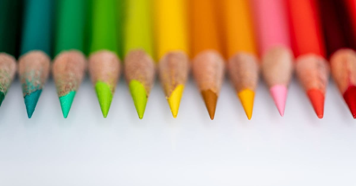
Photo: Skyler Ewing / Pexels
In 2007, psychologist Andrew Elliot and colleagues at the University of Rochester published a study in which participants were assigned a participant number on a red or green card before taking an anagram test. Those given red numbers scored 20% lower than those given green numbers. The effect held across five experiments with different task types, and the mechanism appeared to be motivational: red activated avoidance motivation (the drive to prevent failure) which impaired the kind of exploratory thinking required for creative problem-solving. It was a rigorous, replicable finding — and it illustrates both what color psychology can offer and where it gets complicated, because the same red that apparently impairs test performance has been associated with competitive advantage in combat sports, higher attractiveness ratings in some studies, and entirely different meanings across cultures. Color affects the mind, but not in the universal, controllable way that marketing manuals suggest.
How the Eye and Brain Process Color
Color is not a property of objects. It is a construction of the nervous system based on the wavelengths of light reflected from surfaces. Objects absorb some wavelengths and reflect others; the reflected wavelengths stimulate cone photoreceptors in the retina, and the brain's visual system interprets the relative activation of different cone types as color experience.
Color perception — the brain's construction of subjective color experience from the pattern of relative activation of short (S), medium (M), and long (L) wavelength-sensitive cone photoreceptors in the retina, processed through opponent-color channels in the visual system.
Human trichromacy — the possession of three cone types — is a relatively recent evolutionary development in primates, likely driven by selection for detecting ripe fruit against green foliage. Short cones (maximally sensitive around 420 nm) respond to violet and blue light. Medium cones (peak around 530 nm) respond to green. Long cones (peak around 560 nm) respond to red-orange. These signals are combined in the retina into two opponent channels — red-green and blue-yellow — and a luminance channel, a processing step that doubles the efficiency of color information transmission to the brain.
The visual cortex processes color through dedicated pathways. The "what" pathway (ventral visual stream) processes color, form, and object identity. Color processing involves the V4 region of the visual cortex, and damage to this area can produce achromatopsia — the loss of color perception while leaving other aspects of vision intact. Crucially, color processing is not isolated to the visual cortex: color information connects rapidly to the limbic system (affecting emotional processing), the prefrontal cortex (affecting categorization and memory), and the hypothalamus (affecting arousal and physiological state).
This direct limbic pathway is the neural basis for color-affect relationships. Colors do not affect mood through a chain of deliberate associations; they can short-circuit to emotional processing systems before conscious categorization occurs.
Source: Conway, B.R. (2014), "Color Signals Through Dorsal and Ventral Visual Pathways," Visual Neuroscience, 31(2), 197–209 — review of dual-pathway color processing and its relationship to color-driven behavioral effects.
Source: Gegenfurtner, K.R. & Kiper, D.C. (2003), "Color Vision," Annual Review of Neuroscience, 26, 181–206 — comprehensive review of the neuroscience of color perception from retinal processing to cortical computation.
The Red-Performance Effect: What the Research Actually Shows
The most carefully studied color-behavior relationship is the effect of red on cognitive performance. Elliot and Maier's 2007 paper in Journal of Experimental Psychology: General launched a substantial research program, and the subsequent decade of work has refined, replicated, and sometimes challenged the original findings.
Red-performance effect — the empirical finding that exposure to the color red in achievement contexts impairs performance on cognitive tasks by activating avoidance motivation, the drive to prevent failure rather than approach success.
The proposed mechanism is semantic and motivational, not physiological. Red is associated across many cultures with danger, error, and failure (red ink marking mistakes, red traffic lights, blood). In an achievement context — a test, an exam, a competitive evaluation — red activates a schema of failure threat. This activates avoidance motivation, which narrows cognitive focus toward error detection and away from the exploratory, risk-tolerant thinking required for creative problem-solving and anagram completion.
Across Elliot and Maier's five experiments, the impairment was specific to cognitive achievement tasks. Red did not impair performance on a simple physical strength task (handgrip), and some evidence suggested it may enhance performance on tasks requiring rapid, forceful responses. The cognitive impairment was also modulated by threat relevance: when red appeared in a context that did not signal evaluation (as a decorative element rather than a performance-relevant cue), the effect diminished.
However, a 2020 meta-analysis published in PLOS ONE by Lehmann and colleagues, reviewing all published studies of the red-performance effect, found a smaller average effect size than the original papers suggested and documented evidence of publication bias — studies finding null effects were less likely to be published. The meta-analysis concluded that the red-performance effect is likely real but substantially smaller and more context-dependent than the original 2007 paper implied.
| Context | Effect of Red | Evidence Strength |
|---|---|---|
| Cognitive achievement (tests, anagrams) | Impairs performance via avoidance motivation | Moderate — effect real but smaller than original papers |
| Physical competitive performance (sport) | May enhance (dominance signaling?) | Mixed — some studies find advantage, mechanism unclear |
| Attractiveness ratings (red clothing) | Increases perceived attractiveness | Moderate across several cultures |
| Food and appetite | Decreases food intake in some contexts | Weak — highly situational |
| Reaction time (simple tasks) | May speed responses (heightened arousal) | Weak and inconsistent |
| Room color and perceived room temperature | Some evidence red rooms rated as warmer | Replication status uncertain |
Source: Elliot, A.J. & Maier, M.A. (2007), "Color and Psychological Functioning," Current Directions in Psychological Science, 16(5), 250–254 — summary of the red-performance effect research program.
Source: Lehmann, G.K., Elliot, A.J., & Calin-Jageman, R.J. (2018), "Meta-Analysis of the Effect of Red on Performance," Motivation and Emotion, 42(6), 791–804 — meta-analytic review finding the effect is smaller and more variable than initial studies suggested.
Color and Affect: What Influences Mood and Arousal
Beyond the red-performance effect, the broader question of how colors influence emotional states has a longer research history and a messier empirical record. The challenge is disentangling three interacting sources of color-affect relationships: universal physiological responses, learned cultural associations, and individual differences.
Some physiological effects of color are relatively well-documented. High-wavelength colors (reds, oranges) produce measurable increases in skin conductance, heart rate, and cortical arousal compared to low-wavelength colors (blues, greens) under controlled conditions. Blue-enriched light at short wavelengths (approximately 480 nm) directly stimulates intrinsically photosensitive retinal ganglion cells that project to the suprachiasmatic nucleus — the brain's circadian clock — suppressing melatonin and increasing alertness. This is not strictly a color psychology effect (it operates through a dedicated non-visual pathway), but it illustrates that not all color-biology relationships are mediated by learned associations.
The emotional associations with specific colors, however, are far more learned than they are innately given. Studies of color-emotion associations across cultures by Jonauskaite and colleagues (2020, published in Psychological Science) surveyed participants from 30 countries across six continents and found that while some color-emotion associations were consistent (yellow was associated with joy globally; black with grief), others showed substantial cultural variation. Red was associated with love and passion in many Western cultures but was associated with luck and prosperity in Chinese cultural contexts — a difference with direct implications for marketing and design.
Even within a culture, color-affect relationships are context-dependent. The same shade of blue reads as calming in a bedroom, authoritative in a corporate logo, and melancholic in an artistic context. The "feelings" triggered by a color are not properties of the color wavelength but emerge from the interaction of the color with its semantic context, prior associations, and the current goals of the perceiver.
Source: Jonauskaite, D. et al. (2020), "Universal Patterns in Color-Emotion Associations Are Further Shaped by Linguistic and Geographic Proximity," Psychological Science, 31(10), 1245–1260 — 30-country study of color-emotion associations finding both universal patterns and substantial cultural variation.
Source: Elliot, A.J. & Maier, M.A. (2012), "Color-in-Context Theory," Advances in Experimental Social Psychology, 45, 61–125 — theoretical framework specifying that color effects on psychology are modulated by the semantic context in which the color appears.
The Marketing Myths: Where Color Psychology Gets Distorted
The gap between color psychology research and color psychology as it appears in marketing and design literature is substantial, and understanding it requires distinguishing between claims that have genuine empirical support and claims that have been amplified beyond their evidence base.
The most persistent marketing myth is the "93% of purchase decisions are based on visual appearance/color alone" statistic. This figure circulates endlessly in design and marketing content and traces back to a 1994 survey study ("Impact of Color on Marketing" by Satyendra Singh, published in Management Decision) that measured respondents' beliefs about their own behavior, not their actual purchasing patterns. Self-reports of purchase decision-making are notoriously unreliable, and the study has been widely misrepresented even in its actual conclusions.
A related myth involves specific color recommendations: red creates urgency, so use it for sale stickers; blue builds trust, so banks should be blue; green signals health, so wellness brands should be green. These recommendations extract context-free rules from research findings that are always context-dependent. Red creates urgency in Western contexts with achievement-relevant framings. Blue may signal authority or trustworthiness in corporate contexts where those associations have been culturally reinforced. But the associations are not automatic, universal, or sufficiently large to override other design elements.
The "60-30-10 color rule" (60% dominant, 30% secondary, 10% accent) and similar prescriptions are design heuristics based on visual balance, not psychology research — they have no empirical basis in color-behavior effects and do not belong in discussions of color psychology.
What the research does support: color distinctiveness matters for memory and attention. Unusual or high-contrast color choices make stimuli more memorable (the von Restorff isolation effect). Color consistency in branding builds recognition through mere exposure effects, not any intrinsic property of the chosen colors. Color accessibility — ensuring sufficient contrast for individuals with color vision deficiency (approximately 8% of men and 0.5% of women have some form of red-green color vision deficiency) — is practically and ethically important.
Source: Elliot, A.J. (2015), "Color and Psychological Functioning: A Review of Theoretical and Empirical Work," Frontiers in Psychology, 6, 368 — comprehensive review that explicitly distinguishes well-supported color-psychology effects from overgeneralized claims.
Source: Singh, S. (2006), "Impact of Color on Marketing," Management Decision, 44(6), 783–789 — the source of frequently misquoted statistics about color and consumer behavior; the actual study's scope is narrower than common citations suggest.
Cultural Differences in Color Meaning
The assumption that colors carry universal emotional meaning — that red is universally alarming, white universally pure, green universally naturalistic — is empirically false. Color meanings are substantially culturally learned, and the same color can carry opposite valences in different cultural contexts.
White provides a clear example. In most Western cultures, white is associated with purity, cleanliness, and new beginnings — hence white wedding dresses. In many East Asian cultures (China, Japan, Korea, India), white is traditionally associated with death and mourning. Red, in Western achievement contexts, carries failure and danger associations that produce the performance impairment documented by Elliot and Maier. In Chinese cultural contexts, red signifies luck, prosperity, and celebration — so much so that a 2014 study in PLOS ONE found that the red-performance effect was reversed among experienced Chinese stockbrokers, who associated red with positive financial outcomes.
The yellow-joy association found by Jonauskaite's global study holds across cultures, likely because yellow is the color of sunlight and high-energy photons that increase alertness and arousal in ways that may translate across cultures into positive affect. Black's association with grief or death also appears relatively consistent cross-culturally, though the specific rituals and contexts vary.
Green's associations illustrate the interaction of biological and cultural factors. Green is the dominant wavelength in natural environments worldwide, and there is good evidence that exposure to green — through natural environments or even nature imagery — reduces physiological stress markers and improves sustained attention. This "restorative" effect of green environments appears relatively universal, possibly reflecting evolved response patterns to safe, resource-rich natural habitats. But green's secondary associations (environmentalism, naivety, envy) are culturally specific.
The practical implication for anyone designing for a global audience is that color psychology research conducted primarily in Western samples should not be generalized globally. The effect of color on human psychology is real, but the direction and magnitude of that effect depends on what meanings the color carries in the perceiver's cultural frame — which is not fixed by the wavelength.
Source: Hupka, R.B., Zaleski, Z., Otto, J., Reidl, L., & Tarabrina, N.V. (1997), "The Colors of Anger, Envy, Fear, and Jealousy: A Cross-Cultural Study," Journal of Cross-Cultural Psychology, 28(2), 156–171 — cross-cultural study documenting significant variation in color-emotion associations across six countries.
Source: Zhang, Y., Feick, L., & Price, L.J. (2006), "The Impact of Self-Construal on Aesthetic Preference for Angular versus Rounded Shapes," combined with findings from Pan, W. et al. (2014), "Experience Reverses the Red Effect Among Chinese Stockbrokers," PLOS ONE, 9(2), e89643 — demonstrated that cultural learning can reverse the direction of color-behavior effects.
Color, Light, and Circadian Biology
One color-biology relationship that stands on particularly firm ground is the effect of short-wavelength (blue) light on the circadian system and sleep. This is not strictly a psychological effect of color but involves the direct action of specific wavelengths on retinal ganglion cells that are distinct from the rods and cones involved in color vision.
Intrinsically photosensitive retinal ganglion cells (ipRGCs), discovered by David Berson and colleagues in 2002, contain the photopigment melanopsin, which is maximally sensitive to light around 480 nm — the blue range. These cells project directly to the suprachiasmatic nucleus (the circadian pacemaker) and to other brain regions involved in arousal. Their primary function is not image formation but environmental light detection for circadian entrainment and the pupillary light reflex.
Evening exposure to blue-enriched light — from LED screens, smartphones, and energy-efficient lighting — suppresses melatonin secretion and delays circadian phase, making it harder to fall asleep at the appropriate biological time. This is an effect of wavelength, not of learned color association: the brain is using short-wavelength light as a signal for daytime, and evening exposure confuses the system. Amber or red-shifted lighting in the evening, which lacks significant short-wavelength content, produces less circadian disruption.
This has made blue light filtration a significant topic in sleep research, and it represents one of the most practically important color-biology effects. A 2017 study by Gooley and colleagues published in PNAS found that exposure to room light in the evening suppressed melatonin in 99% of individuals and shortened melatonin duration by about 90 minutes compared to dim light conditions. The effect was driven largely by the short-wavelength content of standard indoor lighting.
Source: Berson, D.M., Dunn, F.A., & Takao, M. (2002), "Phototransduction by Retinal Ganglion Cells That Set the Circadian Clock," Science, 295(5557), 1070–1073 — discovery of intrinsically photosensitive retinal ganglion cells and their role in circadian entrainment.
Source: Gooley, J.J. et al. (2011), "Exposure to Room Light before Bedtime Suppresses Melatonin Onset and Shortens Melatonin Duration in Humans," Journal of Clinical Endocrinology & Metabolism, 96(3), E463–E472 — demonstrated the magnitude of melatonin suppression from evening light exposure.
Frequently Asked Questions
Q: Does painting a room a certain color meaningfully change mood or productivity?
A: Small effects are plausible, but the evidence for large, durable mood changes from wall color alone is weak. Studies do show that more saturated colors increase arousal measures temporarily and that exposure to blue or green environments can have mild stress-reducing effects. However, the dominant influence on how a room feels is usually lighting quality, spatial arrangement, and personal associations — not the specific hue of the walls. Color choice has aesthetic and attentional effects; treating it as a psychological intervention overstates the research.
Q: Is color therapy scientifically valid?
A: In its clinical claims — that specific colors applied to the body or room can treat diseases, improve organ function, or cure psychological disorders — color therapy lacks credible empirical support and is not recognized by evidence-based medicine. There are genuine, measurable effects of light wavelength on circadian biology (blue light and melatonin suppression) and some effects of environment color on arousal and stress measures, but these do not constitute medical treatments.
Q: Why do so many people agree that red is exciting and blue is calming if it is not universal?
A: Within Western cultural contexts, these associations are highly consistent because they are learned from shared cultural exposure — fire trucks, emergency signals, and blood are red; sky, water, and cool environments are blue. The consistency within a culture does not mean the associations are innate or universal. The Chinese red-is-lucky association and the Western red-is-dangerous association are equally learned and equally consistent within their cultural groups.
Q: Does red really make people more attractive?
A: There is moderate evidence that red clothing increases perceived attractiveness and romantic appeal in heterosexual contexts, documented by Elliot and Niesta (2008) in Journal of Personality and Social Psychology and subsequently replicated in several cultures. The proposed mechanism involves the cross-cultural association of red with status and dominance, and for women wearing red, with sexual signaling. The effect size is modest (not transformative), and it varies by context and cultural background.
Q: Can color-blind people be affected by color psychology in the same way?
A: People with red-green color vision deficiency (the most common form) process the red and green wavelengths indistinctly or not at all, depending on the subtype. For color-psychology effects that depend on learned associations with specific hues (like the red-failure association), the effect would be expected to be reduced or absent in individuals who cannot reliably distinguish red from green. For effects driven by wavelength-dependent physiology (like blue light's effect on melatonin), cone-based color deficiency does not affect ipRGC function, so circadian effects would remain.
Q: What is the best color for concentration?
A: Research does not support strong prescriptions, and individual variation is high. Low-arousal colors (blue, green, desaturated) are generally associated with reduced distraction in attention tasks, and some studies show modestly better performance on detail-oriented tasks in blue environments compared to red. High-arousal colors (red, orange) may support tasks requiring energy and speed. Natural green environments consistently show attentional restoration effects in studies of restorative environments. The safest practical guidance: neutral, low-distraction color environments with good lighting quality.
For more on how perception connects to emotion and decision-making, see Why We Feel Emotions: The Science and The Psychology of Decision-Making. The way environmental cues shape behavior through conditioning connects to The Skinner Box and Operant Conditioning.
The Takeaway
Color affects human psychology through at least three distinct mechanisms: direct physiological pathways (blue light and the circadian system), semantic context activation (red triggering failure-avoidance schemas in achievement settings), and learned cultural associations that vary substantially across populations. The effects are real but context-dependent, culturally variable, and considerably smaller and more conditional than marketing literature suggests. The science of color psychology is most useful when it specifies when, for whom, and under what conditions a given color effect operates — not when it claims simple, universal rules that ignore cultural learning and individual variation.
Read next:
Follow new articles
Add SciHub101 to your feed reader to see new science and technology stories.
About the Author
SciHub101 is an independent science and technology publication founded and edited by Buğra Sözeri, a software engineer and app developer based in Türkiye. AI tools assist with drafting and research. Source documentation in the existing archive is uneven, and articles are being reviewed and corrected. The Editorial Team byline identifies editorial responsibility; it does not certify specialist or independent human review. Where we compare products, anything built by our own team is labelled as such — see the editorial guidelines and About page for how corrections and disclosures work.
Related Articles
The Psychology of Creativity: How the Brain Generates New Ideas
The psychology of creativity explained: divergent thinking, the default mode network, the incubation effect, why the right-brain myth is wrong, and how constraints paradoxically boost creative output.

The Psychology of Attraction: What Science Says About Why We're Drawn to Each Other
The psychology of attraction explained: proximity, similarity, the mere-exposure effect, physical symmetry, Helen Fisher's three stages of love, and the science of adult attachment styles.
The Psychology of Colour: How Colour Affects Your Emotions and Behaviour
Colour is not merely visual — it influences mood, appetite, heart rate, and buying decisions. The science of colour psychology spans neuroscience, cultural anthropology, and marketing. Some effects are biological; many are cultural; almost all are more powerful than we realise.
Why Do We Experience Déjà Vu? The Science of the Already-Seen
Déjà vu—the uncanny sense of having already experienced a present moment—occurs in roughly 60% of people at least once in their lifetime. The phenomenon is not a supernatural gift or sign of precognition, but rather a temporary glitch in the brain's memory and perception systems. Leading theories propose that déjà vu arises from a mismatch between memory familiarity and recollection: the brain perceives current sensory input as familiar but cannot retrieve the source or details. This can occur through multiple mechanisms, including delayed signal transmission between perceptual and memory regions, retrieval of similar (but different) memories, or the hippocampus signaling familiarity without context. The phenomenon declines with age, occurs more frequently in people who travel and experience novel environments, and in rare cases can signal temporal lobe epilepsy. Understanding déjà vu reveals how memory familiarity and conscious recollection are distinct neural processes that can become dissociated.

The Science of Learning: How We Actually Learn
The science of learning explained: spaced repetition, retrieval practice, the testing effect, why rereading fails, and the myth of learning styles debunked by cognitive research.

The Psychology of Habits: How the Brain Automates Behavior
Habits are not willpower failures — they are the brain's efficiency system. The cue-routine-reward loop, basal ganglia chunking, and the science of how long habit formation actually takes.