Why Accessibility Improves Web Products

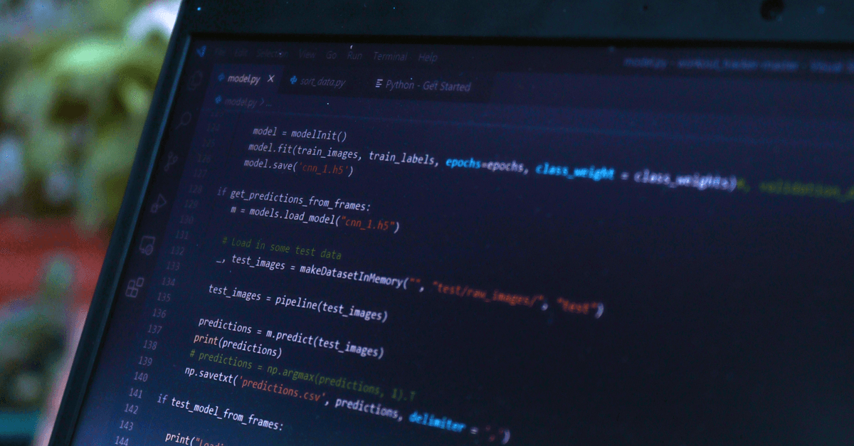
Photo: Daniil Komov / Pexels
A screen reader user navigating a page relies entirely on the underlying HTML structure to know what's on the screen, since screen readers announce elements based on semantic tags and ARIA (Accessible Rich Internet Applications) attributes, not visual layout. Building for that user forces a discipline that ends up benefiting everyone: clear heading structure, descriptive link text, and properly labeled form fields. This is why accessibility work, done properly, tends to improve a web product's overall usability rather than existing as a separate, isolated feature, and why the businesses that treat it as core engineering practice consistently outperform the ones that bolt it on at the end.
What a screen reader actually reads
A screen reader like NVDA, JAWS, or VoiceOver doesn't see a webpage the way a sighted user does. It builds a navigable model of the page purely from HTML semantics: heading tags (<h1> through <h6>) let users jump directly to sections by importance, <button> and <a> tags announce themselves as interactive controls, and <label> elements tied to form inputs tell the user what each field expects before they type anything into it. A <div> styled to look like a button provides none of this information to a screen reader unless a developer manually adds ARIA roles to compensate for what native HTML would have given for free.
This is also why alt text on images matters beyond simple politeness. A screen reader reads the alt attribute aloud in place of an image, so a missing or vague alt attribute, like alt="image123.jpg" or an empty alt="" on a photo that carries real information, leaves a blind or low-vision user with no information about content that a sighted user absorbs in a fraction of a second. The W3C's Web Accessibility Initiative (WAI) documentation on text alternatives frames this precisely: alt text should convey the same information and function as the image, not just describe its filename or general subject.
Keyboard-only navigation reveals a similar gap. Sighted mouse users skim visually and click wherever they want. Users who cannot operate a mouse, whether due to a motor impairment, a temporary injury, or simple preference, move through a page using Tab, Shift+Tab, Enter, and arrow keys. If a custom dropdown or modal was built with <div> and JavaScript click handlers instead of native, focusable elements, keyboard users can get stuck inside it with no way to close it or move past it. This is one of the most common accessibility failures found in third-party audits, and it is almost always invisible to a developer who tested only with a mouse.
The standard that defines what "accessible" actually means
Accessibility is not a vague aesthetic judgment. It is governed by a specific, testable standard: the Web Content Accessibility Guidelines (WCAG), maintained by the World Wide Web Consortium (W3C) through its Web Accessibility Initiative. WCAG defines success criteria across four principles, commonly abbreviated POUR: content must be Perceivable, Operable, Understandable, and Robust. Each success criterion is assigned to one of three conformance levels, A, AA, or AAA, based on how essential and how broadly achievable the requirement is (W3C, WCAG 2.2).
WCAG 2.2 became an official W3C Recommendation on October 5, 2023, adding nine new success criteria on top of WCAG 2.1, including requirements around focus visibility and reducing accidental drag-only interactions (W3C, WCAG 2.2). WCAG is versioned but cumulative. Meeting WCAG 2.2 at a given level also means meeting the equivalent criteria from 2.1 and 2.0, since each new version adds criteria rather than replacing the underlying principles. This matters for teams choosing a target: most regulatory guidance and legal settlements in the United States point to WCAG 2.1 Level AA as the practical baseline, not the newer 2.2 spec, so a team building today should treat 2.1 AA as the floor and 2.2 as the direction of travel.
| Level | What it covers | Example requirement | Typical use case |
|---|---|---|---|
| A | Minimum baseline; content is unusable for some users without it | Images have alt text; page has no keyboard traps | Legal floor in most jurisdictions |
| AA | Addresses the most common and impactful barriers | Color contrast ratio of at least 4.5:1 for normal text; text resizes to 200% without loss of content | Standard target for most commercial and government sites |
| AAA | Highest conformance; often impractical site-wide | Sign language interpretation for video; contrast ratio of 7:1 | Applied selectively, rarely as a full-site requirement |
WCAG defines three conformance levels, but W3C itself notes that AAA is not recommended as a general policy for entire sites because some content cannot satisfy every AAA criterion regardless of design quality (W3C, WCAG 2.2).
Why accessible markup and SEO overlap so heavily
Search engine crawlers, much like screen readers, rely on semantic HTML to understand a page's structure and importance hierarchy. Neither a crawler nor a screen reader can see font size, color, or spatial layout the way a sighted user does. Both need the semantic <h2> tag itself to know that a piece of text functions as a heading, and both need a real <a href> to know that a piece of text is a link rather than styled decoration.
This overlap isn't a coincidence, and it isn't new. Google's developer documentation on accessible, crawlable content has long emphasized that clear heading structure, descriptive link text, and properly structured lists help both assistive technology and search engines parse a page's content and relationships correctly. A page with a logical <h1> → <h2> → <h3> outline gives a search engine the same map it gives a screen reader: what the page is about, and how its sections relate to each other. For a deeper look at how a browser assembles that structure into something renderable in the first place, see How Browsers Render Web Pages.
This is also where accessibility connects to a site's broader technical SEO health. A crawler that can parse a page's structure quickly and unambiguously spends its "crawl budget" more efficiently, and a page that loads its accessible markup without excessive client-side JavaScript rewriting tends to also perform better on Core Web Vitals, since simpler DOM structures generally render and become interactive faster. That relationship between structural clarity and page speed is explored further in Why Web Performance Affects SEO. Structured data, the machine-readable markup that tells search engines what a page's content actually represents (a recipe, a product, an article), depends on the same clean, consistent markup discipline that accessibility requires; see Why Structured Data Helps Search Engines for how that connection plays out in practice.
None of this means accessibility work is "secretly SEO work" or that teams should build for crawlers and call it accessibility. The two disciplines have different goals: one exists to make a page usable by people with disabilities, the other to make a page rankable by algorithms. But because both goals are served by the same underlying practice, clean, meaningful, standards-compliant HTML, teams that invest in one tend to see gains in the other without extra effort.
The curb-cut effect: why disability-first design helps everyone
The clearest illustration of why accessibility work benefits far more people than the population it was designed for comes from outside the web entirely: sidewalk curb cuts. In the 1970s, disability activists in Berkeley, California pushed cities to cut small ramps into street corners so wheelchair users could cross streets without being stuck at a curb. The ramps were built for a specific group with a specific need.
What happened next is the reason the idea has its own name, the "curb-cut effect." Parents pushing strollers used the ramps. Delivery workers pushing hand trucks used them. Travelers rolling suitcases used them. Cyclists used them. A feature designed to solve one group's access problem ended up quietly improving mobility for nearly everyone who used a sidewalk, because a physical barrier that was hardest on wheelchair users was, to a lesser degree, an inconvenience for almost everyone else too. The term itself was popularized by writer Angela Glover Blackwell in a 2017 piece describing exactly this pattern in public infrastructure and policy.
Curb-cut effect — a pattern in which a design change made to accommodate people with disabilities ends up benefiting a much larger population who were never the original target.
The web version of this pattern shows up constantly, often in features nobody thinks of as "accessibility" at all.
How captions illustrate the curb-cut effect online
Captions were built for deaf and hard-of-hearing users who cannot process a video's audio track at all. But captions are now used heavily by hearing users watching video with the sound off on a train, in an open office, or in bed next to a sleeping partner. A feature built for one group's necessity became a convenience feature that a much larger population now expects by default, which is exactly the curb-cut pattern playing out in a browser tab instead of on a sidewalk.
How does keyboard navigation help users without disabilities?
Keyboard navigation was built for users who cannot operate a mouse due to a motor impairment. It also benefits power users, developers, and anyone doing repetitive data entry, since navigating a well-structured interface with Tab and Enter is frequently faster than reaching for a mouse, clicking precisely, and reaching back to the keyboard. Accessible keyboard support and interface efficiency are, in practice, the same engineering work.
The legal and business reality
Accessibility is not purely a design preference in the United States. In 2010, the Department of Justice signaled that Title III of the Americans with Disabilities Act (ADA), which prohibits discrimination in "places of public accommodation," applies to websites operated by businesses that serve the public, and courts have continued to apply that reasoning in subsequent litigation even without a finalized DOJ web-specific regulation. That legal ambiguity, a broad statute written in 1990 for physical buildings, applied by courts to a medium that didn't exist in its current form when the law was written, has produced a large and steadily growing body of litigation.
According to tracking published by law firm Seyfarth Shaw, plaintiffs filed 3,117 federal website accessibility lawsuits in 2025, up 27 percent from 2,452 in 2024, making these cases roughly 36 percent of all federal ADA Title III lawsuits filed that year (Seyfarth Shaw, ADA Title III blog, 2026). This is not a niche legal risk confined to large e-commerce brands. Plaintiffs' firms have targeted businesses across nearly every sector with a public-facing website, and the absence of a small business exemption in most of this litigation means company size alone does not provide meaningful protection.
For a business, this reframes accessibility from a "nice to have" polish item into a genuine legal and financial exposure category, alongside data privacy and payment security. Retrofitting a large, <div>-heavy codebase after a lawsuit or demand letter arrives is dramatically more expensive and disruptive than building semantic, accessible markup from the start of a project.
Where accessibility work pays off beyond compliance
Several specific practices demonstrate the curb-cut pattern clearly enough that most product teams end up defending them on usability grounds alone, independent of any legal or compliance argument.
- Keyboard navigation, built to help users who can't use a mouse, also benefits power users who navigate faster with keyboard shortcuts than with clicking, and anyone using a device with a broken or absent trackpad.
- Sufficient color contrast, required by WCAG Level AA at a minimum ratio of 4.5:1 for normal text, also improves legibility for every user in bright sunlight, on a low-quality or aging screen, or simply as eyesight declines with age.
- Descriptive form error messages, needed by screen reader users to understand what went wrong when a
<label>alone isn't enough context, reduce form abandonment and support requests for all users, since vague errors like "invalid input" frustrate everyone equally. - Captions and transcripts on video content, essential for deaf users, are also indexed by search engines as text, giving video content an SEO benefit that pure audio never gets.
- Resizable text without layout breakage, required so users with low vision can zoom to 200 percent, also protects a site's usability on the wide range of screen sizes and pixel densities across modern phones and tablets.
- Focus indicators, the visible outline showing which element is currently active via keyboard, help sighted keyboard users track their position on a page exactly the way a cursor does for a mouse user.
What people get wrong about accessibility
A common misconception is that accessibility is primarily about accommodating a small population of users, so it's reasonable to deprioritize relative to other product work. In practice, the World Health Organization estimates that over 1.3 billion people globally, about 16 percent of the world's population, live with significant disability (WHO, Disability fact sheet). That figure doesn't include temporary or situational impairments, a broken arm limiting mouse use, bright glare limiting screen visibility outdoors, or a noisy environment making audio hard to follow, all of which make accessible design broadly useful well beyond the population with a permanent, diagnosed disability.
Another mistake is treating accessibility as a final add-on step, applying ARIA attributes to existing markup after a product is otherwise complete. Accessible structure is far easier and more effective when built into the semantic HTML from the start, rather than retrofitted onto a <div>-heavy layout that was never designed with structure in mind. ARIA itself carries a well-known caution among accessibility practitioners, sometimes summarized as "no ARIA is better than bad ARIA": adding an incorrect or mismatched ARIA role can actively mislead a screen reader in ways that a plain, unstyled native HTML element never would, because it overrides the browser's own accessibility tree with information the developer supplied by hand.
A third, subtler mistake is assuming automated accessibility scanners catch everything. Automated tools reliably catch missing alt attributes, insufficient color contrast, and missing form labels, but they cannot judge whether an alt description is actually meaningful, whether a tab order makes logical sense, or whether a screen reader user can complete a multi-step checkout flow without confusion. Manual testing, ideally including testing with actual assistive technology users, remains necessary for any product handling meaningful transactions or content, and no automated scanner substitutes for it.
What this looks like in a real development workflow
Teams that treat accessibility as core engineering practice, rather than a compliance checklist run before launch, tend to bake a few habits directly into how they build interfaces. They default to native HTML elements (<button>, <a>, <select>, <label>) instead of styled <div> substitutes whenever a native element does the job, because native elements come with keyboard support, focus handling, and screen reader semantics already built in by the browser. They test critical flows, sign-up, checkout, search, with a keyboard alone before shipping, unplugging the mouse rather than trusting that Tab order "probably" works. They write alt text that describes function and content rather than repeating a filename or a vague generic label, and they leave alt="" intentionally empty only for genuinely decorative images that carry no information.
None of this requires a specialized accessibility team, though larger organizations often do build one. It requires treating accessible markup the same way a team treats semantic HTML generally: as a foundational layer other systems depend on, not a decorative layer applied after the interface already works for one type of user.
The takeaway
Accessibility improves web products because designing for users who rely entirely on semantic structure, screen reader users, keyboard-only users, users with low vision, forces clearer information architecture that benefits every visitor, while also aligning closely with what search engine crawlers need to understand a page. The curb-cut effect explains why this keeps happening: features built for a specific, often underestimated population, captions, keyboard support, high contrast, tend to become general usability improvements once they exist. Combined with a real and growing legal exposure around ADA website litigation, the case for building accessible structure from the start, rather than retrofitting it later, is rarely a tradeoff between accessibility and general usability. Done correctly, they're largely the same work.
Read next:
- Why Structured Data Helps Search Engines
- How Browsers Render Web Pages
- Why Web Performance Affects SEO
FAQ
Q: Why does accessibility overlap so much with SEO?
Both screen readers and search engine crawlers rely on semantic HTML, headings, labeled forms, descriptive link text, rather than visual styling, to understand a page's structure, so improvements made for one often help the other. The goals differ, one serves people with disabilities, the other serves ranking algorithms, but the underlying markup discipline is largely the same.
Q: Is website accessibility a legal requirement in the United States?
The Department of Justice has taken the position since 2010 that the Americans with Disabilities Act applies to websites operated as places of public accommodation, and courts have continued to apply that reasoning. Plaintiffs filed 3,117 federal website accessibility lawsuits in 2025 alone, according to Seyfarth Shaw's tracking, making it a real and growing legal consideration, not just a best practice.
Q: What is ARIA and when is it needed?
ARIA (Accessible Rich Internet Applications) attributes provide semantic information to assistive technology when native HTML elements don't already convey it, such as adding a role to a custom-styled interactive component that isn't a native <button> or <a> tag. Accessibility practitioners generally recommend using a native HTML element instead of ARIA whenever one is available, since incorrect ARIA can actively mislead a screen reader.
Q: Does accessible design only help users with disabilities?
No. Features like keyboard navigation, high color contrast, and video captions also benefit users in situational contexts, such as bright sunlight, temporary injuries, or watching video without sound, a pattern known as the curb-cut effect, making accessible design broadly useful well beyond its original target population.
Q: What is the difference between WCAG Level A, AA, and AAA?
Level A covers the minimum baseline needed for basic usability by assistive technology. Level AA addresses the most common and impactful barriers and is the standard most laws and regulations reference. Level AAA is the highest conformance level, but the W3C itself does not recommend it as a policy for entire sites, since some content cannot satisfy every AAA criterion regardless of design quality.
Q: Do automated accessibility scanners catch every problem?
No. Automated tools reliably catch structural issues like missing alt attributes, insufficient color contrast, and unlabeled form fields, but they cannot judge whether an alt description is meaningful or whether a full user flow works logically with a keyboard or screen reader. Manual testing remains necessary for any product handling meaningful transactions or content.
Follow new articles
Add SciHub101 to your feed reader to see new science and technology stories.
About the Author
SciHub101 is an independent science and technology publication founded and edited by Buğra Sözeri, a software engineer and app developer based in Türkiye. AI tools assist with drafting and research. Source documentation in the existing archive is uneven, and articles are being reviewed and corrected. The Editorial Team byline identifies editorial responsibility; it does not certify specialist or independent human review. Where we compare products, anything built by our own team is labelled as such — see the editorial guidelines and About page for how corrections and disclosures work.
Related Articles

Web Accessibility Guide 2026 — WCAG, ARIA, Testing Tools
Web accessibility for developers: what WCAG 2.2 AA requires, how to use semantic HTML and ARIA, keyboard support, and a testing workflow that catches bugs.

Game Accessibility: Making Games for Everyone
Gaming's future includes everyone. Accessibility features enable disabled players to experience games. Inclusive design benefits all players, not just those with disabilities.