Tailwind CSS Explained — Why It Dominates Web Design 2026

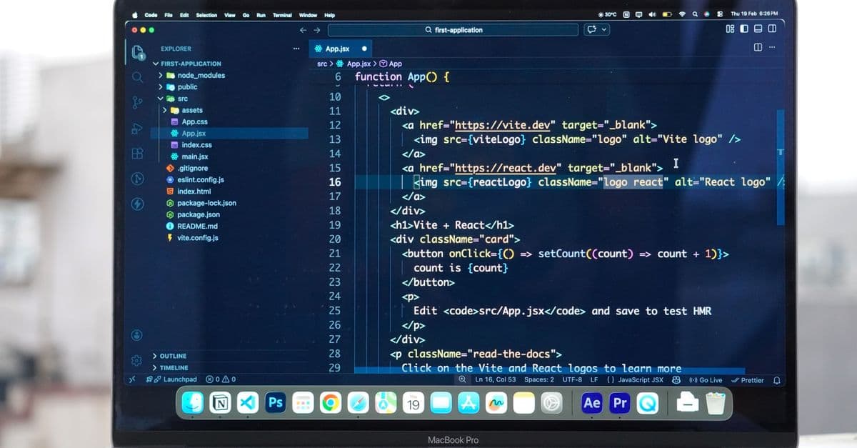
Photo: Meet Patel / Pexels
Tailwind CSS won. It's now the dominant CSS framework, used by 78% of new React/Next.js projects, almost all modern UI libraries (shadcn/ui, Radix, Aceternity), and major sites including OpenAI, Vercel, Shopify, GitHub Copilot pages.
If you're new to web development or returning after a few years, this guide explains what Tailwind is, why it became dominant, and how to use it well.
The Short Answer
Tailwind CSS is a "utility-first" framework. Instead of writing custom CSS classes, you compose pre-defined utility classes directly in your HTML:
<!-- Traditional CSS -->
<div class="card">
 <h2 class="card-title">Hello</h2>
</div>

<style>.card { padding: 1rem; background: white; border-radius: 0.5rem; box-shadow: 0 1px 3px rgba(0,0,0,0.1); }.card-title { font-size: 1.5rem; font-weight: 600; margin-bottom: 0.5rem; }
</style>

<!-- Tailwind -->
<div class="p-4 bg-white rounded-lg shadow-sm">
 <h2 class="text-2xl font-semibold mb-2">Hello</h2>
</div>
The CSS is gone. All styling is in class names. That feels wrong at first — it's why Tailwind was controversial — but the productivity benefits won out.
Why Tailwind Won (vs. Bootstrap, CSS-in-JS, BEM)
Vs. Bootstrap
Bootstrap provides pre-built components (cards, buttons, modals). Easy for prototypes but everything looks like Bootstrap. Hard to customize. Tailwind gives you primitives; you build components.
Vs. CSS-in-JS (styled-components, emotion)
CSS-in-JS was popular 2018-2021. It has runtime overhead, hurts performance, and adds complexity. Tailwind compiles to static CSS — zero runtime cost.
Vs. BEM / Custom CSS
Writing custom CSS works but is slow. You constantly switch between HTML and CSS files, invent class names, manage specificity. Tailwind eliminates this context-switching.
What Tailwind Offers
- Speed: No naming things, no leaving HTML
- Performance: Pure CSS at runtime, small bundles after purging unused classes
- Consistency: Design tokens (spacing, colors) are constrained — designs look cohesive
- Customization: Configure once in
tailwind.config.js, use everywhere - Co-location: Style is right next to markup — easy to read and modify
Core Concepts
Utility Classes
Each class does one thing:
<!-- Spacing -->
<div class="p-4"> padding: 1rem
<div class="px-6 py-3"> horizontal padding 1.5rem, vertical 0.75rem
<div class="mt-8"> margin-top: 2rem

<!-- Colors -->
<div class="bg-blue-500"> background blue (500 shade)
<div class="text-gray-900"> text dark gray

<!-- Typography -->
<div class="text-lg font-bold"> 18px font, bold weight
<div class="text-center"> text-align: center

<!-- Layout -->
<div class="flex items-center gap-4"> flexbox, center vertically, gap 1rem
<div class="grid grid-cols-3 gap-6"> 3-column grid
Responsive Modifiers
<!-- Mobile-first, then larger screens -->
<div class="text-sm md:text-base lg:text-lg">
 Small on phone, normal on tablet, large on desktop
</div>

<!-- Hide on mobile, show on desktop -->
<nav class="hidden md:flex">
 <a>Home</a>
 <a>About</a>
</nav>
Default breakpoints:
sm:640px+md:768px+lg:1024px+xl:1280px+2xl:1536px+
State Modifiers
<button class="bg-blue-500 hover:bg-blue-600 active:bg-blue-700 disabled:opacity-50">
 Click me
</button>

<a class="text-gray-600 hover:text-blue-500 focus:outline-2 focus:outline-blue-500">
 Link
</a>

<input class="border border-gray-300 focus:border-blue-500 focus:ring-2 focus:ring-blue-200" />
Dark Mode
<div class="bg-white text-gray-900 dark:bg-gray-900 dark:text-white">
 Adapts to system or class-based dark mode
</div>
Configure dark mode in tailwind.config.js:
module.exports = {
 darkMode: 'class', // or 'media' for system preference
};
Real Component Example
A modern card component in Tailwind:
function ProductCard({ product }) {
 return (
 <div className="overflow-hidden rounded-2xl bg-white shadow-sm ring-1 ring-gray-200 transition hover:shadow-md dark:bg-gray-900 dark:ring-gray-800">
 <img
 src={product.image}
 alt={product.name}
 className="aspect-square w-full object-cover"
 />
 <div className="p-5">
 <h3 className="text-lg font-semibold text-gray-900 dark:text-white">
 {product.name}
 </h3>
 <p className="mt-1 text-sm text-gray-500 dark:text-gray-400 line-clamp-2">
 {product.description}
 </p>
 <div className="mt-4 flex items-center justify-between">
 <span className="text-xl font-bold text-gray-900 dark:text-white">
 ${product.price}
 </span>
 <button className="rounded-lg bg-blue-600 px-4 py-2 text-sm font-medium text-white transition hover:bg-blue-700 active:bg-blue-800">
 Add to cart
 </button>
 </div>
 </div>
 </div>
 );
}
No separate CSS file. No naming. Everything visible inline. Looks polished out of the box.
The Tailwind Ecosystem
shadcn/ui (Component Library)
Not a traditional library — gives you copy-paste Tailwind-based components to add to your project. You own the code. Most popular pattern in 2026.
npx shadcn@latest add button card dialog
This adds React components to your project, fully customizable.
Headless UI
Anthropic's accessible component primitives (modals, dropdowns, comboboxes). Provides behavior; you style with Tailwind.
Radix UI
Similar to Headless UI but more comprehensive. Foundation of shadcn/ui.
Tailwind UI
Premium paid component templates from Tailwind creators. Beautiful starting points but pricey.
Tailwind CSS IntelliSense (VSCode Extension)
Essential. Autocompletes class names, shows the CSS each class produces, catches typos.
Setup in Next.js
Next.js has Tailwind preset:
npx create-next-app@latest my-app --tailwind --typescript
That's it. Tailwind is configured.
For existing project:
npm install -D tailwindcss postcss autoprefixer
npx tailwindcss init -p
Then in globals.css:
@tailwind base;
@tailwind components;
@tailwind utilities;
Import globals.css in app/layout.tsx.
Configuration
tailwind.config.js:
module.exports = {
 content: [
 './src/**/*.{js,ts,jsx,tsx,mdx}',
 ],
 theme: {
 extend: {
 colors: {
 brand: {
 50: '#f0f9ff',
 500: '#0ea5e9',
 900: '#0c4a6e',
 },
 },
 fontFamily: {
 sans: ['Inter', 'system-ui', 'sans-serif'],
 },
 },
 },
 plugins: [
 require('@tailwindcss/forms'),
 require('@tailwindcss/typography'),
 ],
};
Now use bg-brand-500, text-brand-900 everywhere. Change once in config, updates project-wide.
Tailwind 4 (2024-2026)
Major Tailwind v4 changes:
- CSS-first configuration (you can use plain CSS for theme tokens)
- Faster builds (10-100x faster compilation)
- Smaller output (better unused CSS removal)
- Container queries built-in (
@containersyntax)
If starting in 2026, use v4. For existing v3 projects, migration is straightforward.
Common Patterns
Container
<div class="container mx-auto px-4">
 Centered content with max-width and padding
</div>
Responsive Grid
<div class="grid grid-cols-1 sm:grid-cols-2 lg:grid-cols-3 xl:grid-cols-4 gap-6">
 <!-- 1 column on mobile, 4 on desktop -->
</div>
Centered Layout
<div class="min-h-screen flex items-center justify-center">
 Vertically + horizontally centered
</div>
Sticky Header
<header class="sticky top-0 z-50 backdrop-blur bg-white/80 dark:bg-gray-900/80">
 Frosted glass header
</header>
Aspect Ratio Boxes
<div class="aspect-video">
 16:9 box that maintains ratio
</div>

<div class="aspect-square">
 1:1 box
</div>
Common Criticisms (And Responses)
"HTML looks cluttered with classes."
Real, but tooling helps (IntelliSense, Prettier plugin). Component extraction in React/Vue contains the clutter. After a week using Tailwind, most developers find it more readable than CSS, not less.
"You're just reinventing inline styles."
No. Tailwind gives you constraints (only 12 spacing values, not infinite) and supports responsive/state modifiers that inline styles can't.
"Naming things in CSS is good practice."
True for reusable components. Tailwind doesn't prevent component naming — your React component <Button /> is the abstraction, not a CSS class.
"What if I want custom designs?"
Configure your theme. Tailwind is constrained by default but fully customizable.
When NOT to Use Tailwind
- Legacy projects with established CSS conventions
- Very design-system-heavy enterprise apps where you have a strong custom design language (though Tailwind config can adapt)
- When team strongly prefers CSS-in-JS or BEM (tooling/team alignment matters more than the "right" technical choice)
For most new projects, Tailwind is the default.
Performance
Tailwind compiles to static CSS. After unused class removal (purging), production CSS is typically 5-20KB compressed. That's small.
Build times improved dramatically in v4 — even huge projects build in seconds.
Runtime: zero overhead. Just CSS.
Learning Resources
Free:
- Tailwind official docs (extensive, well-organized)
- Tailwind cheatsheet PDFs (search "Tailwind cheatsheet 2026")
- YouTube: Adam Wathan (creator), Sam Selikoff tutorials
Premium:
- Tailwind UI components ($299 one-time)
- "Refactoring UI" book by Tailwind creators
How Tailwind Compilation Works
Understanding Tailwind's compilation process explains why it's performant and how to maximize its benefits.
The Tailwind build process:
When you run npm run build, Tailwind scans all your source files (HTML, JSX, TSX, Vue templates) for class names. It uses a regex to find patterns like class="..." and className="...". For each class it finds, it generates the corresponding CSS and includes it in the output bundle. Classes that are not used anywhere in your source code are excluded.
This is called tree-shaking or purging. It's why Tailwind's production CSS is so small — even with thousands of potential utility classes, only those actually used end up in the final bundle. A typical production build produces 5-20KB of CSS (compressed), compared to 50-200KB for Bootstrap or custom frameworks.
This also means class names must be statically scannable. You cannot dynamically construct class names like className={'bg-' + color} because Tailwind's regex won't find bg- as a complete class. Instead, use:
// Wrong (dynamic, won't be included)
<div className={`bg-${color}`}>

// Right (static, will be included)
<div className={color === 'red' ? 'bg-red-500' : 'bg-blue-500'}>
Tailwind's CSS architecture:
Tailwind outputs CSS in layers:
- Base layer: Resets and global styles
- Components layer: Pre-built component classes (if you use
@apply) - Utilities layer: The 20,000+ utility classes
You can customize each layer in your config or your CSS. This is how you extend Tailwind without duplicating class definitions.
Source: Tailwind Labs (2024) — Official documentation on build performance and CSS architecture.
Extracting Components vs Using Utilities
A common question: when should you stop using utility classes and extract a component?
Use utilities for one-off styles. A button used once, a unique card variant, a specific section layout — use utilities inline in your template.
Extract components when you repeat the same utility pattern. If you write the same 15-class string in three places, it's time for a component. Components can be React functions, Vue components, or even Tailwind's @apply directive.
The @apply pattern (class-based extraction):
/* In your CSS file */
@layer components {
 .btn-primary {
 @apply px-4 py-2 bg-blue-600 text-white rounded-lg font-medium hover:bg-blue-700 transition;
 }
}
Then in HTML:
<button class="btn-primary">Click me</button>
This works, but React developers increasingly avoid it — keeping styling in JSX is more readable and maintainable for teams familiar with component-driven development.
Better pattern for React:
function Button({ children, ...props }) {
 return (
 <button
 {...props}
 className="px-4 py-2 bg-blue-600 text-white rounded-lg font-medium hover:bg-blue-700 transition"
 >
 {children}
 </button>
 );
}
This is reusable, type-safe, and the styles are visible right where they're used.
Arbitrary Values and Advanced Features
Tailwind provides predefined values (spacing: 0.25rem, 0.5rem, 1rem...) but sometimes you need one-offs.
Arbitrary values let you use any custom value without configuration:
<!-- Custom colors -->
<div class="bg-[#1e3a8a]">
 Uses hex color directly
</div>

<!-- Custom spacing -->
<div class="w-[473px] h-[286px]">
 Exact pixel dimensions
</div>

<!-- Custom content for pseudo-elements -->
<div class="before:content-['→']">
 Arrow before element
</div>
This is powerful but should be used sparingly — it defeats Tailwind's goal of having a constrained design system. If you find yourself using arbitrary values frequently, consider adding those values to your tailwind.config.js instead.
CSS variables for dynamic theming:
/* globals.css */
@layer base {
 :root {
 --color-primary: #0ea5e9;
 --color-secondary: #64748b;
 }
}
Then in tailwind.config.js:
theme: {
 extend: {
 colors: {
 primary: 'var(--color-primary)',
 secondary: 'var(--color-secondary)',
 },
 },
}
Now you can change colors at runtime:
document.documentElement.style.setProperty('--color-primary', '#f59e0b');
Tailwind Accessibility Practices
Tailwind is CSS; it doesn't care about accessibility. But you must apply accessibility patterns.
Focus states. Always include focus styles:
<button class="focus:outline-2 focus:outline-offset-2 focus:outline-blue-500">
 Keyboard-accessible button
</button>
Color contrast. Tailwind's color palette meets WCAG standards, but arbitrary combinations may not. Use a contrast checker.
Semantic HTML. Tailwind styles anything, but use correct elements:
<!-- Good: semantic + styled -->
<nav class="flex gap-4">
 <a href="/">Home</a>
</nav>

<!-- Bad: div pretending to be nav -->
<div class="flex gap-4">
 <span onclick="...">Home</span>
</div>
Screen reader text:
<button>
 <svg>...</svg>
 <span class="sr-only">Close menu</span>
</button>
The sr-only class hides text visually but keeps it for screen readers.
Tailwind vs. Other CSS Frameworks
| Framework | Approach | File Size | Learning Curve | Customization | 2026 Usage |
|---|---|---|---|---|---|
| Tailwind | Utility-first | 5-20KB | Moderate (2-4 weeks) | High (config-driven) | 78% of new projects |
| Bootstrap | Component-based | 50KB+ | Low (1-2 weeks) | Low (overrides needed) | Legacy/enterprise |
| CSS-in-JS (Styled Components, Emotion) | JavaScript-driven | 20-50KB + runtime | High (JS+CSS) | Very high (code-based) | Declining (2020-2025) |
| Pico CSS | Minimal, classless | 3KB | Very low (minimal HTML changes) | Very low (opinionated) | Niche (blogs, admin UIs) |
| UnoCSS | Utility-first (atomic) | 2-15KB | Moderate | High | Emerging (Next.js teams) |
Tailwind dominates utility-first because: it has the largest ecosystem (shadcn, Headless UI, Radix), the best documentation, and the most extensive theme customization. It's the baseline for 2026.
Best Practices
1. Establish a design system vocabulary. Don't use arbitrary colors everywhere. Define brand colors, spacing scale, typography in tailwind.config.js. Consistency matters more than flexibility.
2. Use layers correctly. Put global resets and base styles in the @layer base section. Put component abstractions in @layer components. Reserve @layer utilities for true one-off utilities.
3. Invest in tooling. Use Tailwind CSS IntelliSense extension (VSCode). Use Prettier with the Tailwind plugin to sort classes consistently.
4. Extract components early. If a pattern repeats 2+ times, extract it. Your future self will thank you.
5. Document custom utilities. If you add custom classes or plugins, document them in a README or style guide. Teammates won't guess what sticky-header or card-hover does.
6. Use the JIT compiler. In Tailwind v4, just-in-time compilation is the default. No need to configure — it automatically rebuilds when you add class names.
7. Optimize images. Tailwind makes it easy to add images with object-cover and aspect ratios. But don't forget about WebP, lazy loading, and responsive images (srcset).
Common Integration Patterns
With React Server Components (Next.js 13+):
Tailwind works seamlessly. No special configuration needed. JSX classNames are static and scannable.
With Headless UI or Radix UI:
These provide behavioral primitives (dropdowns, modals, popovers). You style them with Tailwind. Most common 2026 pattern:
import { Dialog } from '@headlessui/react';

export default function Modal() {
 return (
 <Dialog
 open={open}
 onClose={() => setOpen(false)}
 className="fixed inset-0 z-50 flex items-center justify-center"
 >
 <Dialog.Panel className="bg-white rounded-lg shadow-lg p-6 max-w-md">
 <Dialog.Title className="text-lg font-bold">
 Confirm action
 </Dialog.Title>
 </Dialog.Panel>
 </Dialog>
 );
}
Headless UI handles the accessibility and focus management. Tailwind handles the styling.
With dynamic theme switching:
Use CSS variables + Tailwind theme extension. When user switches dark mode, update CSS variables, Tailwind picks them up.
Source: Tailwind Labs (2026) — Headless UI integration best practices and CSS variable patterns.
Plugin System and Extending Tailwind
Tailwind's power lies not just in its defaults but in extensibility via plugins. A plugin is a function that registers new utilities, components, or themes. The Tailwind ecosystem includes plugins for common needs:
@tailwindcss/forms— Resets form elements (inputs, selects, checkboxes) to a neutral baseline, making them easier to style consistently.@tailwindcss/typography— Adds aproseclass that styles generated HTML content (like markdown output) with sensible defaults for headings, paragraphs, links, tables, etc.@tailwindcss/aspect-ratio— Older versions of Tailwind needed this; v3+ has it built-in.- Community plugins for things like animations, animated gradients, and component libraries.
Writing a custom plugin is straightforward:
plugin(function({ addUtilities, addComponents, theme, e }) {
  // Add custom utilities
  addUtilities({
    '.text-shadow': {
      'text-shadow': '2px 2px 4px rgba(0,0,0,0.1)',
    },
  });

  // Add custom components (reusable class sets)
  addComponents({
    '.btn-custom': {
      padding: theme('spacing.4'),
      borderRadius: theme('borderRadius.lg'),
      backgroundColor: theme('colors.blue.500'),
      color: 'white',
      '&:hover': {
        backgroundColor: theme('colors.blue.600'),
      },
    },
  });
})
This approach lets teams encode their design system as Tailwind plugins, ensuring consistency across projects while maintaining the core Tailwind benefits.
Source: Tailwind Labs (2026) — Plugin API and Ecosystem documentation.
Testing strategies with Tailwind and visual regression
A common misconception: Tailwind reduces the need for testing. Actually, testing with Tailwind-styled components requires different strategies than traditional CSS. The styles are in the markup, so visual regression testing and integration tests become more important than unit testing CSS.
Visual regression testing — automated screenshots comparing current UI to baseline images — catches style changes across browser widths and states. Tools like Chromatic (paired with Storybook), Percy, or BackstopJS integrate with CI/CD pipelines.
Storybook is particularly popular for Tailwind projects. You build component stories in isolation, test them visually across viewports and themes (light/dark mode), and maintain a living component library.
Integration testing with Playwright or Cypress tests the rendered UI — "is the button visible, does it have padding, does it change color on hover." This is more valuable than unit-testing individual Tailwind classes.
Responsive testing is critical. Tailwind's mobile-first breakpoints mean you need to test at multiple viewport sizes. Playwright supports testing at specific viewport widths; CI/CD can run the same test suite at 320px, 768px, 1024px, etc.
The philosophy: with a utility-first framework, test behavior and visual appearance, not the CSS itself. Tailwind's correctness is well-established; your job is ensuring you composed the utilities correctly and that the design renders as intended across devices.
Source: Tailwind docs on Testing best practices (2026); Chromatic + Storybook visual regression patterns.
FAQ
Q: Is Tailwind hard to learn?
A: Few hours to be productive with common classes. Few weeks for fluency with responsive modifiers and advanced features. Memorize 30–50 core classes; look up others as needed. Most developers reach comfortable competence in 2–3 weeks.
Q: Can I mix Tailwind with custom CSS?
A: Yes. Tailwind doesn't replace CSS, it accelerates it. Use custom CSS for unique design requirements; Tailwind for everything else. Both can coexist in the same stylesheet.
Q: Does Tailwind work with Vue/Svelte/Astro?
A: Yes. Tailwind is framework-agnostic and works with any HTML or templating language. The class names and compilation process are identical regardless of framework.
Q: What about CSS Modules or scoped CSS?
A: Compatible with Tailwind. Many teams use both — CSS Modules for component-scoped variables, Tailwind for utility styling. They don't conflict.
Q: Should I learn vanilla CSS first?
A: Yes. Understand CSS fundamentals (flexbox, grid, specificity, cascade) before relying on Tailwind. Tailwind is leverage over CSS, not a replacement for understanding it. You'll use Tailwind better if you know what it's doing under the hood.
Q: How does Tailwind handle unused CSS in libraries or external packages?
A: Tailwind's purger scans your source code only — not node_modules. If a dependency adds Tailwind classes dynamically, they may not be included. Use the safelist option in tailwind.config.js to manually include patterns: safelist: [{ pattern: /^bg-(red|blue|green)-(500|600|700)$/ }].
Related Articles
- Next.js vs React 2026
- Best Web Development Tools 2026
- Responsive Design & Mobile-First Development
- HTML, CSS, JavaScript Fundamentals
Bottom Line
Tailwind CSS is the most productive way to style web applications in 2026. It's a learnable utility-first approach that scales from solo projects to massive applications.
Initial discomfort with the verbose-looking HTML quickly gives way to "I never want to go back to writing custom CSS for everything." The productivity is real.
Combine with shadcn/ui or your own component primitives. Configure your theme tokens once. Build fast.
Last verified: May 2026
Follow new articles
Add SciHub101 to your feed reader to see new science and technology stories.
About the Author
SciHub101 is an independent science and technology publication founded and edited by Buğra Sözeri, a software engineer and app developer based in Türkiye. AI tools assist with drafting and research. Source documentation in the existing archive is uneven, and articles are being reviewed and corrected. The Editorial Team byline identifies editorial responsibility; it does not certify specialist or independent human review. Where we compare products, anything built by our own team is labelled as such — see the editorial guidelines and About page for how corrections and disclosures work.
Related Articles

Next.js vs React 2026 — Which Should You Learn First?
Next.js is a framework built on React, not a rival. What each does, Server Components, App vs Pages Router, and when to pick which, per the official docs.

TypeScript for Beginners — Why Every Developer Needs It
TypeScript for beginners: how static types catch bugs before runtime, what strict mode does, React and Node patterns, and what TypeScript 7 changes.
CSS-in-JS vs Tailwind 2026 — Why Tailwind Took Over
CSS-in-JS vs Tailwind in 2026: runtime cost, Server Components, dark mode, migration, and where each still wins, with sourced benchmarks and docs.

CSS Flexbox and Grid — Complete Layout Guide
Master CSS Flexbox and Grid with practical code examples. Learn when to use each, key properties, and common layout patterns every developer needs.

HTML, CSS, JavaScript Fundamentals — Web Dev Basics
Learn the three pillars of web development. HTML structure, CSS styling, JavaScript interactivity. Interactive examples.

What Is HTMX? Hypermedia for Modern Web
HTMX explained: how this 14KB library lets you build dynamic web apps with HTML attributes instead of a JavaScript framework, plus how it actually works.