What Is shadcn/ui? Copy-Paste UI Components

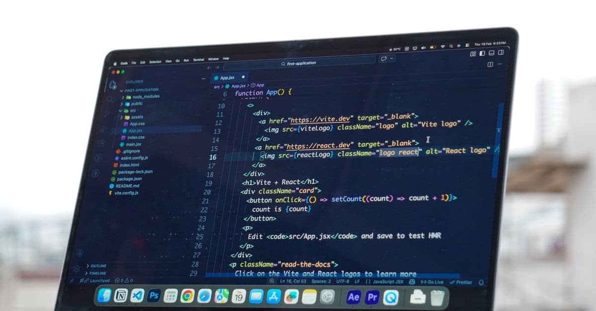
Photo: Sıla Toklu / Pexels
shadcn/ui is not a component library — it's a CLI that copies React component source code directly into your project. Run npx shadcn@latest add button, and a real button.tsx file lands in your repo, built from Tailwind CSS, Radix UI primitives, and a small typed variant system. You own every line, so there is no black-box package to fight when a design spec says "make the corners sharper" or "we need a fourth button variant nobody predicted."
That distinction — library versus distribution mechanism — is the reason shadcn/ui became one of the default starting points for new React and Next.js projects between 2023 and 2026. This piece walks through how the copy-paste model actually works under the hood, what's inside a generated component, how it compares to the npm-install libraries it displaced, and where it still falls short.
What problem shadcn/ui was built to solve
Component libraries have always forced a trade-off. Install Material UI or Ant Design and you get hundreds of polished, accessible components for free — but you also get their opinions baked in. Overriding a deeply nested style means fighting specificity wars with !important, digging through theme provider documentation, or wrapping components in styled layers just to change a border radius.
The opposite extreme is building everything from scratch: writing your own dropdown menu, your own dialog, your own combobox, each with correct keyboard navigation and ARIA (Accessible Rich Internet Applications, the attribute set that tells screen readers what a custom widget does) attributes. That's weeks of work per component if done properly, and most teams don't do it properly — which is why so many custom-built web dropdowns are unusable with a keyboard alone.
shadcn/ui, created by a designer-engineer who goes by the handle shadcn and who joined Vercel as a Design Engineer in August 2023, split the difference. According to Vercel co-founder Guillermo Rauch's public acknowledgment of the hire, the project had already "changed the way [developers] think about building and distributing UI" before shadcn formally joined the company (x.com/rauchg). The project started as a personal side project in January 2023 and grew through word of mouth in the React community rather than a marketing push.
How the copy-paste distribution model actually works
Traditional component libraries ship as compiled packages you import from node_modules:
npm install @mui/material
import { Button } from '@mui/material'
The component's source lives inside node_modules, hidden from your editor's day-to-day view, versioned by the library maintainer, and updated (or broken) whenever you bump a dependency. Customization happens through the API surface the maintainers decided to expose — props, a theme object, or a styling escape hatch like MUI's sx prop.
shadcn/ui inverts that relationship entirely. Instead of a package, you get a registry — a hosted collection of component source files, organized as JSON manifests that the CLI reads and writes to disk.
npx shadcn@latest add button
That command does not touch node_modules. It writes an actual button.tsx file to components/ui/button.tsx inside your own project, along with any dependencies the component needs (Radix packages, class-variance-authority, clsx). The component becomes source code in your git history, reviewable in a pull request, editable in your own editor, and searchable with your own IDE tools. There's no vendor to file an issue with if you want to change how focus rings render — you just open the file.
Think of it like the difference between renting a furnished apartment and buying a house with a basic renovation already done. The apartment (a traditional library) is move-in ready, but knock down a wall and you're violating the lease. The house (shadcn/ui) took someone else's floor plan and materials, but the deed is in your name — repaint, extend, gut the kitchen, whatever the product needs.
How is shadcn/ui different from a normal npm package?
A normal npm package ships compiled code you import at runtime; you never see or edit its source in your own repo. shadcn/ui's CLI copies the actual, uncompiled component source files into your project directory. From that point on, the component is yours — updates from the shadcn registry never silently overwrite it unless you explicitly re-run the add command.
The three technologies stitched together underneath
Every shadcn/ui component is an assembly of three separate open-source projects, none of which shadcn wrote from scratch. Understanding the split helps explain both the strengths and the sharp edges.
Tailwind CSS handles the visual layer. Every component ships with utility classes (flex, rounded-md, px-4, hover:bg-primary/90) directly in the JSX, rather than a separate stylesheet or CSS-in-JS runtime. That's a deliberate bet: Tailwind compiles to a static, small CSS bundle at build time, and the SciHub101 comparison piece on CSS-in-JS versus Tailwind covers why that build-time approach displaced runtime styling libraries like styled-components through the mid-2020s.
Radix UI Primitives handle behavior and accessibility for anything interactive — dialogs, dropdown menus, popovers, tooltips, accordions, tabs. Radix's own documentation states that "every Radix Primitive is built to align with the WAI-ARIA Authoring Practices," and that components are tested against real assistive technology including NVDA, JAWS, and VoiceOver screen readers (radix-ui.com/primitives/docs/overview/accessibility). Radix owns the hard, easy-to-get-wrong parts: trapping keyboard focus inside an open modal, restoring focus to the trigger element when it closes, wiring aria-expanded and aria-controls correctly, and making Escape and arrow-key navigation behave the way assistive technology users expect.
class-variance-authority (CVA), paired with tailwind-merge, is the smallest but most practically useful piece. CVA lets a component declare a typed set of variants — variant: "default" | "destructive" | "outline", size: "sm" | "default" | "lg" — and generates the right combination of Tailwind classes for each. tailwind-merge resolves conflicts when two class strings collide, so passing className="rounded-full" into a component that already has rounded-md doesn't silently produce broken, duplicated CSS.
None of these three pieces is proprietary to shadcn. That's the point — shadcn/ui is glue and taste, applied consistently across dozens of components, distributed through a CLI instead of a package registry.
Why does shadcn/ui require Radix UI instead of building its own primitives?
Building accessible interactive components from scratch is disproportionately expensive relative to their visual complexity. A dropdown menu looks simple but requires correct roving tabindex behavior, typeahead search, and ARIA state management to be usable by keyboard and screen-reader users. Radix had already solved that problem publicly and permissively, so shadcn built a styling and distribution layer on top instead of re-solving it.
A working example, end to end
After running npx shadcn@latest add button card, both files exist in components/ui/. A typical usage looks like this:
import { Button } from "@/components/ui/button"
import { Card, CardHeader, CardTitle, CardContent } from "@/components/ui/card"

export default function Demo() {
  return (
    <Card className="max-w-sm">
      <CardHeader>
        <CardTitle>Welcome</CardTitle>
      </CardHeader>
      <CardContent>
        <Button variant="default" size="lg">Get started</Button>
      </CardContent>
    </Card>
  )
}
If a design review comes back asking for fully rounded buttons instead of the default rounded-md corners, there's no theme object to locate, no override prop to discover in documentation. Open components/ui/button.tsx, find the CVA variants object, and change the class string. The edit takes effect everywhere the Button component is used, because it's one file, not a runtime override applied per-instance.
That said, the same openness cuts the other way. Nothing stops one developer from editing button.tsx in a way that silently diverges from what a teammate expects, because there's no semantic version number gating the change. Teams that skip code review on component files can end up with visually inconsistent buttons across a codebase within a few months — a risk that simply doesn't exist with a locked npm dependency.
Theming with CSS variables, not a JavaScript theme object
shadcn/ui's theming layer lives in plain CSS custom properties, set in globals.css:
:root {
  --background: 0 0% 100%;
  --foreground: 222.2 84% 4.9%;
  --primary: 222.2 47.4% 11.2%;
  --primary-foreground: 210 40% 98%;
  --radius: 0.5rem;
}

.dark {
  --background: 222.2 84% 4.9%;
  --foreground: 210 40% 98%;
}
Colors are stored as HSL (hue, saturation, lightness) triplets rather than hex codes, which makes programmatic adjustments — darkening a color for a hover state, for instance — a matter of nudging one number instead of recalculating a hex value. Dark mode is a single class, .dark, toggled on the <html> element; every component that references var(--background) or var(--primary) updates automatically, with zero JavaScript re-render and no theme context provider wrapping the app.
This is architecturally different from how Material UI or Chakra UI handle theming, where a JavaScript theme object is created, passed through a React context provider, and consumed via hooks or styled-system props at render time. CSS variables resolve in the browser's style engine before React even runs, which is part of why shadcn/ui apps tend to have less theme-related layout flicker on initial load.
Why shadcn/ui spread so fast through the React ecosystem
Five structural reasons explain the adoption curve between 2023 and 2026, beyond simple hype.
- Code ownership removes an entire category of bug reports. When a component doesn't behave the way a team needs, there's no waiting on an upstream maintainer to accept a pull request or ship a patch release. The fix is local and immediate.
- Accessibility is inherited, not re-earned. Radix's WAI-ARIA compliance and screen-reader testing transfer directly into every shadcn/ui component, which matters enormously for teams building for government, education, healthcare, or enterprise clients where accessibility is a legal requirement (in the US, under Section 508 and the ADA) rather than a nice-to-have.
- The visual defaults look intentional out of the box. Spacing, hover states, focus rings, and dark mode were designed with restraint rather than maximalism, which reduced the "obviously a template" look that plagued earlier free UI kits.
- Theming is genuinely trivial. A short list of CSS variables controls an entire application's palette, which is a small enough surface area that non-specialist developers can safely touch it.
- The MIT license removes legal friction. Teams can use, modify, and ship the code commercially without royalties or attribution requirements, which matters for companies with legal review processes around dependencies.
Vercel's own adoption played a structural role too: as the company behind Next.js and the v0 AI UI-generation tool, Vercel's decision to build v0's output around shadcn/ui components meant that a large share of AI-generated React interfaces in 2024–2026 defaulted to the shadcn/ui component shape, reinforcing the pattern across thousands of new projects that never manually chose it.
Comparing shadcn/ui against the React UI libraries it displaced
The right comparison isn't "shadcn/ui versus everything" — it's understanding which model fits a given project's constraints.
React UI library comparison, 2026
| Library | Distribution model | Typical bundle impact | Accessibility baseline | Customization depth | Built-in dark mode |
|---|---|---|---|---|---|
| shadcn/ui | Copy-paste source via CLI | Only what you actually add | Excellent (built on Radix, WAI-ARIA tested) | Total — you own the file | Yes, via CSS variables |
| Material UI (MUI) | npm package | Large; 300 KB+ uncompressed before tree-shaking | Good | Moderate — theme object + sx prop |
Yes |
| Chakra UI | npm package | Medium | Very good | Good — style props | Yes |
| Ant Design | npm package | Large | Good | Moderate | Yes |
| Headless UI | npm package | Tiny | Excellent | Total — no styles shipped at all | Manual |
| Mantine | npm package | Medium to large | Very good | Good | Yes |
| Radix UI (primitives) | npm package, unstyled | Tiny per primitive | Excellent | Total | Manual |
Bundle-impact figures are directional, drawn from package documentation and common tree-shaking reports rather than a single controlled benchmark; actual weight depends heavily on which components a given app uses.
Radix UI sits at the bottom of the table deliberately — it's the foundation shadcn/ui is built on, not a competing finished product. Choosing between shadcn/ui and raw Radix UI is really a question of whether a team wants Tailwind-styled defaults out of the box or wants to design the visual layer entirely from scratch.
Where each approach wins
shadcn/ui wins for teams already committed to Tailwind CSS who want a product that doesn't look like a template, and who are comfortable owning more files in exchange for more control. It's a strong fit for early-stage startups iterating fast on visual identity, agencies building bespoke client sites, and any team that has hit the customization ceiling of a traditional library mid-project.
Material UI wins for enterprise dashboards and admin tools where Google's Material Design language is an acceptable (or desired) visual baseline, and where the team needs complex out-of-the-box components — data grids with sorting, filtering, and virtualization; date range pickers; rich autocomplete — that would take weeks to replicate manually even with Radix primitives as a starting point.
Ant Design wins in similar enterprise territory, particularly for teams building internal tools or products targeting markets where Ant Design's conventions are already the norm, and where its extensive table and form components outweigh the visual customization cost.
Headless UI wins for teams that want Tailwind Labs' first-party pairing with Tailwind CSS but plan to write every visual style themselves from a blank canvas — a smaller, narrower toolkit than Radix, with fewer components but tight integration with the Tailwind ecosystem.
Where shadcn/ui loses
The copy-paste model has real costs that are easy to underweight in the excitement phase.
No centralized dependency updates. If Radix ships a security patch or accessibility fix to a primitive a project already copied in, that fix does not arrive automatically. Someone has to notice the upstream change and manually re-run add or hand-patch the local file, which is a maintenance burden a locked npm install doesn't carry.
More files to review and maintain. A project using 20 shadcn/ui components has 20 extra files living in the repository, each of which is now the team's code to review, test, and keep consistent — not a black box someone else maintains.
Not a fit outside Tailwind. Every component ships styled with Tailwind utility classes. A team on CSS Modules, vanilla CSS, or a CSS-in-JS library like styled-components would need to rewrite every component's styling layer, which erases most of the time-savings the CLI is supposed to provide.
No built-in complex data components. There is no shadcn/ui data grid with built-in virtualization, column resizing, and server-side sorting comparable to what MUI's X-Grid or Ant Design's Table ships out of the box. Building one from shadcn/ui primitives is possible but is itself a multi-week project.
Drift risk without discipline. Because every component is fully editable local code, two engineers can independently "fix" the same component in incompatible ways if there's no code-review discipline around the components/ui/ directory. The freedom that makes shadcn/ui powerful is the same freedom that lets a design system erode silently.
Installing shadcn/ui in a Next.js project
# 1. Create or open a Next.js + Tailwind project
npx create-next-app@latest my-app
cd my-app

# 2. Initialize shadcn/ui
npx shadcn@latest init

# 3. Add components as needed
npx shadcn@latest add button card dialog input form
The init command writes a components.json configuration file recording import aliases, the base color palette, and the Tailwind config path, then injects the CSS variable block into globals.css. Every subsequent add command reads that configuration to know where new component files should land. The same CLI also supports Vite, Remix, Astro, Gatsby, and TanStack Start — anywhere a project runs React with Tailwind CSS, the workflow is identical.
Beyond components: blocks, charts, and third-party registries
By 2026, shadcn had expanded well past single components into a broader distribution protocol:
- Blocks — pre-assembled page sections such as authentication screens, dashboard layouts, and marketing hero sections, installable with the same
addcommand as a single button. - Charts — typed wrappers around the Recharts library with sensible default styling, so a team doesn't have to hand-configure axis labels and tooltips from scratch.
- Community themes — swappable CSS variable palettes that recolor an entire application without touching component code.
- Third-party registries — as of shadcn/ui's February and May 2026 changelog updates, any public GitHub repository can publish its own
registry.jsonmanifest, letting other companies and open-source projects distribute their own component sets through the same CLI mechanism shadcn/ui itself uses (ui.shadcn.com/docs/registry/github). That turns the CLI into infrastructure other projects build on top of, not a single company's product.
What people get wrong about shadcn/ui
The most common misconception is calling it "a component library you install," which misdescribes the entire mechanism — there is no node_modules/shadcn-ui package that an app imports from at runtime in the modern workflow. The confusingly named legacy shadcn-ui npm package exists for historical reasons and is deprecated in favor of the shadcn CLI package, which is a build-time tool, not a runtime dependency.
A second common mistake is assuming shadcn/ui components never need updates once copied in. They absolutely can, particularly when Radix or Tailwind ship breaking changes; the difference is that the update is manual and intentional (re-running add, or hand-patching) rather than automatic and silent the way a npm update on a traditional library would be.
A third mistake is treating "you can edit the code" as equivalent to "you should edit the code casually." Teams that succeed with shadcn/ui at scale typically apply the same code review rigor to components/ui/ files that they'd apply to any other shared, load-bearing part of the codebase — because unlike a locked dependency, nothing stops a well-meaning teammate from quietly breaking consistency.
Frequently asked questions
Q: Is shadcn/ui a component library? A: No. It's a CLI that copies component source code from a hosted registry into a project's own file tree. There is no npm package that an application imports components from at runtime in the standard workflow — the code becomes part of the project itself.
Q: Who created shadcn/ui? A: A designer-engineer known online as shadcn, who started the project as a personal side project in January 2023 and joined Vercel as a Design Engineer in August 2023 to continue building it, according to Vercel co-founder Guillermo Rauch's public statement at the time (x.com/rauchg).
Q: Does shadcn/ui require Tailwind CSS? A: Yes. Every component ships styled with Tailwind utility classes rather than a separate stylesheet. Projects not using Tailwind would need to rewrite the styling layer of each component, which removes most of the time savings the tool provides.
Q: Why choose shadcn/ui instead of Material UI or Chakra UI? A: Primarily for full ownership of component source and a smaller bundle footprint, since only the components a project actually adds ship in the build. Accessibility comes largely for free through Radix UI's WAI-ARIA-compliant primitives, which are tested against screen readers including NVDA, JAWS, and VoiceOver.
Q: How does shadcn/ui affect bundle size compared to a traditional library? A: A project only pays for the components it explicitly adds, since the code lives locally rather than as a full package import. Material UI, by contrast, can add 200 to 300 KB or more to a bundle before aggressive tree-shaking, depending on how many components and theme features are used.
Q: Can shadcn/ui be used outside of Next.js?
A: Yes. The CLI officially supports Vite, Remix, Astro, Gatsby, and TanStack Start in addition to Next.js. Any React project with Tailwind CSS configured can run shadcn init and start adding components.
Q: What happens if Radix UI ships a security patch after a component was already copied in?
A: The fix does not apply automatically, because the component is now local source code rather than a linked dependency. A developer has to notice the upstream change and either re-run the add command to overwrite the local file or manually patch it, which is a real maintenance trade-off compared to a locked npm dependency.
Q: Is shadcn/ui free to use commercially? A: Yes. The project is MIT licensed, which permits commercial use, modification, and redistribution without royalties or mandatory attribution.
Q: What are shadcn/ui "blocks"?
A: Pre-assembled, multi-component page sections — authentication screens, dashboard shells, marketing sections — installable through the same CLI add command used for individual components like buttons or dialogs. They're meant to save the time of composing common layouts from scratch.
Q: Can other companies publish their own shadcn-compatible component registries?
A: Yes. Since shadcn/ui's 2026 registry updates, any public GitHub repository can add a registry.json manifest describing its components, and users can install them with the same shadcn CLI used for the official registry, effectively turning the tool into a general component-distribution protocol rather than a single vendor's product.
The takeaway
shadcn/ui succeeded by refusing to be a library in the traditional sense — it's a delivery mechanism for source code that three other well-tested open-source projects, Tailwind CSS, Radix UI, and class-variance-authority, already do the hard work underneath. That trade removes vendor lock-in and API-override fights, but it also moves maintenance responsibility for those component files fully onto the team using them. For a React and Tailwind project willing to own that code and review it like any other shared module, it removes more friction than it adds; for a project that wants someone else to carry the maintenance burden indefinitely, a traditional npm library is still the more honest choice.
Read next:
Follow new articles
Add SciHub101 to your feed reader to see new science and technology stories.
About the Author
SciHub101 is an independent science and technology publication founded and edited by Buğra Sözeri, a software engineer and app developer based in Türkiye. AI tools assist with drafting and research. Source documentation in the existing archive is uneven, and articles are being reviewed and corrected. The Editorial Team byline identifies editorial responsibility; it does not certify specialist or independent human review. Where we compare products, anything built by our own team is labelled as such — see the editorial guidelines and About page for how corrections and disclosures work.
Related Articles

What Is tRPC? End-to-End Typed APIs
tRPC is a TypeScript library for building end-to-end type-safe APIs without code generation, GraphQL schemas, or OpenAPI specs.

Tauri vs Electron — Desktop App Frameworks
Tauri vs Electron compared: bundle size, performance, security, ecosystem. Which desktop framework should you choose in 2026?

Zustand vs Redux — React State Management
Zustand vs Redux compared: bundle size, boilerplate, API, when to use each, plus how Jotai, Valtio, MobX, and TanStack Query fit in 2026.

htmx vs React 2026 — When to Skip the JavaScript Framework
htmx vs React in 2026: how server-sent HTML fragments compare with client-rendered JavaScript, where each fits, and what a documented React-to-htmx port saved.
React Hooks Explained — useState and useEffect
React Hooks explained from scratch: how useState and useEffect work, the dependency array, cleanup, Strict Mode, common bugs, and when not to use an effect.

Next.js vs React 2026 — Which Should You Learn First?
Next.js is a framework built on React, not a rival. What each does, Server Components, App vs Pages Router, and when to pick which, per the official docs.